
The Turkish logo maker.
Turkish uses the Latin alphabet plus six extra letters, and one of them is a genuine trap. Five real examples, and how to get the i right.
Write the brand name exactly as it should appear, in its own script. New accounts get 6 free credits, no card required, and each logo image uses 3.
What makes a Turkish logo different
Turkish has two different letters where English has one i. The dotted i has the capital İ, and the dotless ı has the capital I. A logo that drops a dot for style, or adds one, changes the word. Işık (light) in capitals is IŞIK, and writing it as ISIK or İŞİK is a spelling error to a Turkish reader.
The other extra letters, Ş, Ğ, Ç, Ö and Ü, add marks above and below the line. They collide with tight line spacing in stacked lockups, and many display typefaces draw them poorly or not at all.
5 Turkish logos. What to refine.
Each logo below is shown exactly as generated, next to the direction behind it and a note on what a designer would change next.
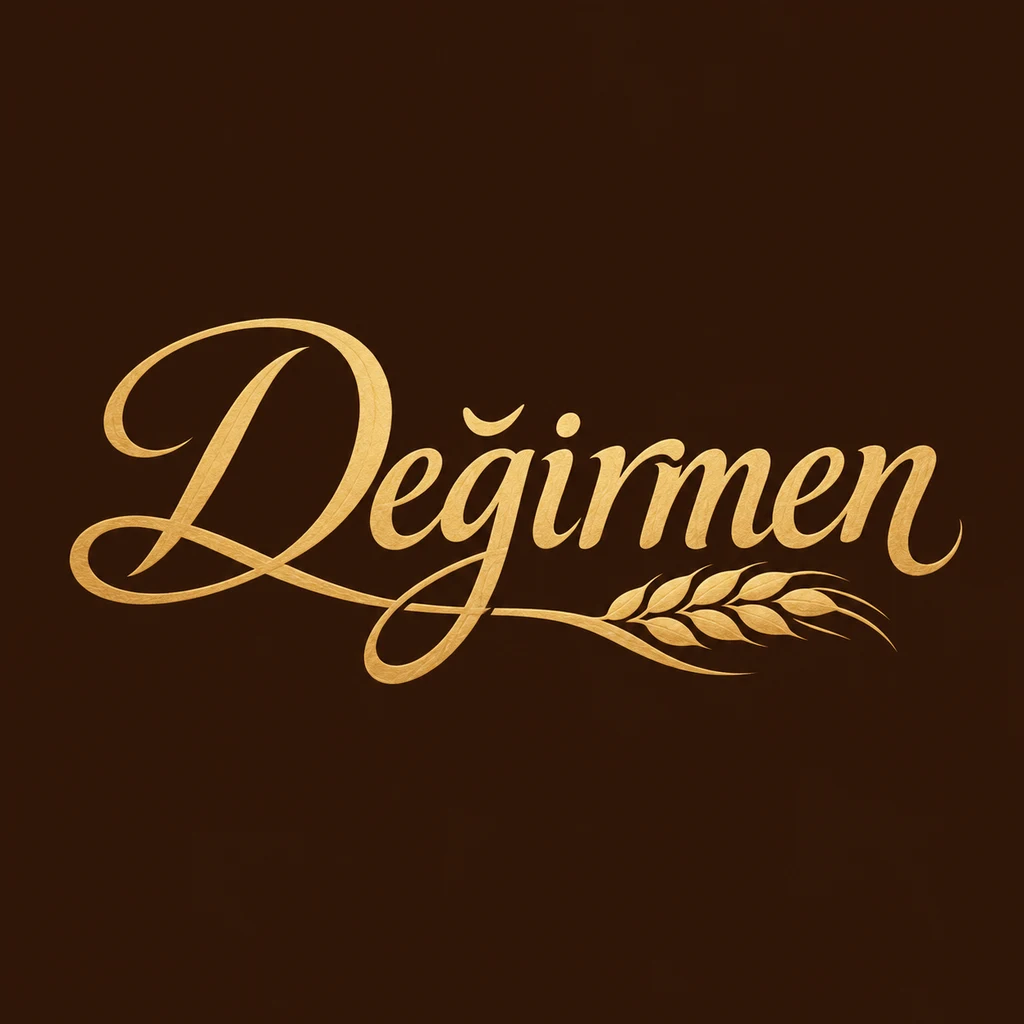
“A calligraphic Turkish wordmark for a bakery called Değirmen, hand-lettered script with the breve on the ğ clearly drawn, wheat gold on deep brown.”
The breve on the ğ is clearly drawn, as asked, and the wheat stalk suits a mill. The script is elaborate; test it on a small bread bag.
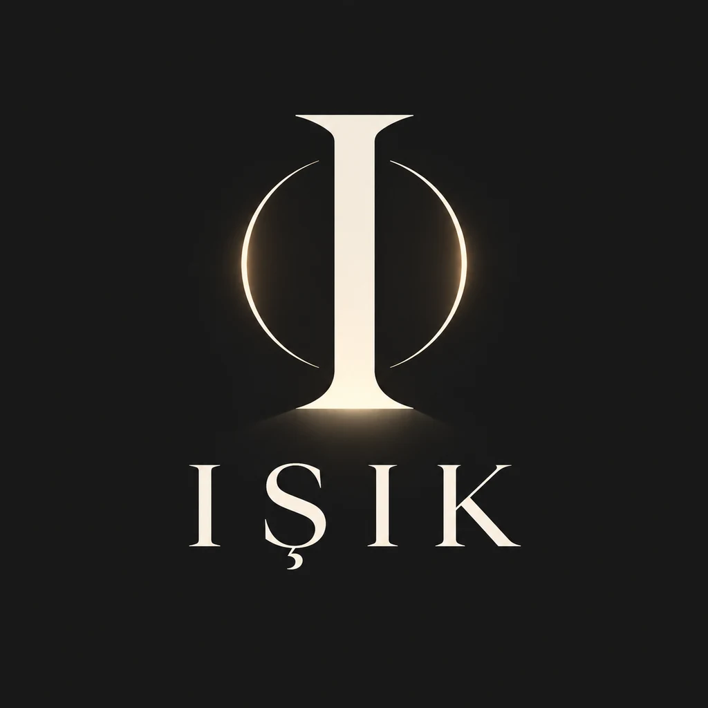
“A geometric Turkish monogram for a lighting studio called Işık, built on the dotless capital I, warm white on charcoal.”
The capitals IŞIK are spelled correctly, with dotless I. The glowing ring is a nice idea but relies on a gradient; keep a flat version.
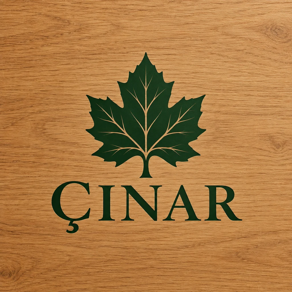
“A Turkish logo for a furniture maker called Çınar, a minimal plane tree symbol beside a clean wordmark with a well-drawn cedilla, forest green on oak.”
ÇINAR is spelled correctly in capitals, with a clear cedilla. The symbol is a leaf rather than a tree; either is fine, but decide which the brand means.
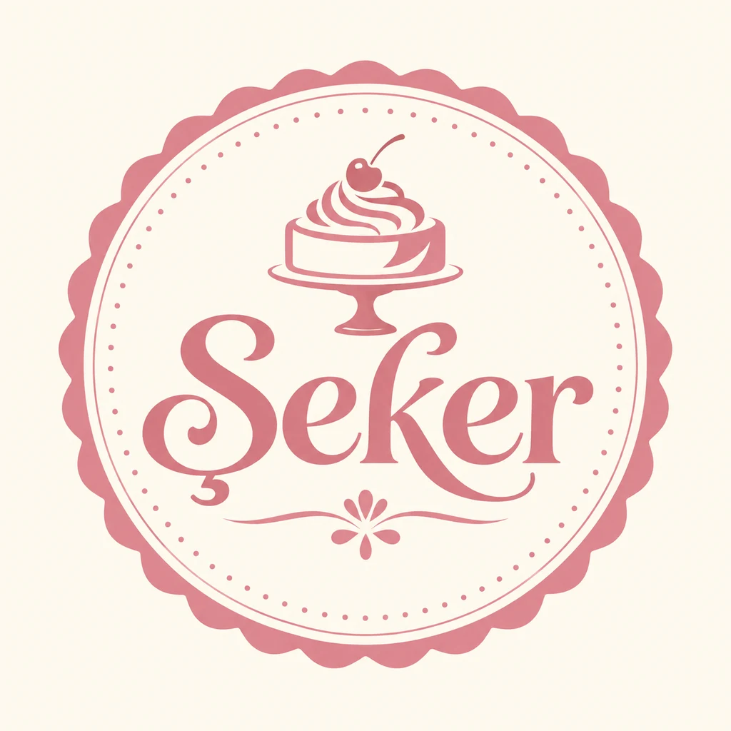
“A Turkish badge logo for a patisserie called Şeker, the wordmark set inside a round pastry seal, rose pink on cream.”
Sweet and fitting, with the Ş clearly drawn. The dotted border and cake are small details; simplify them for a box sticker.
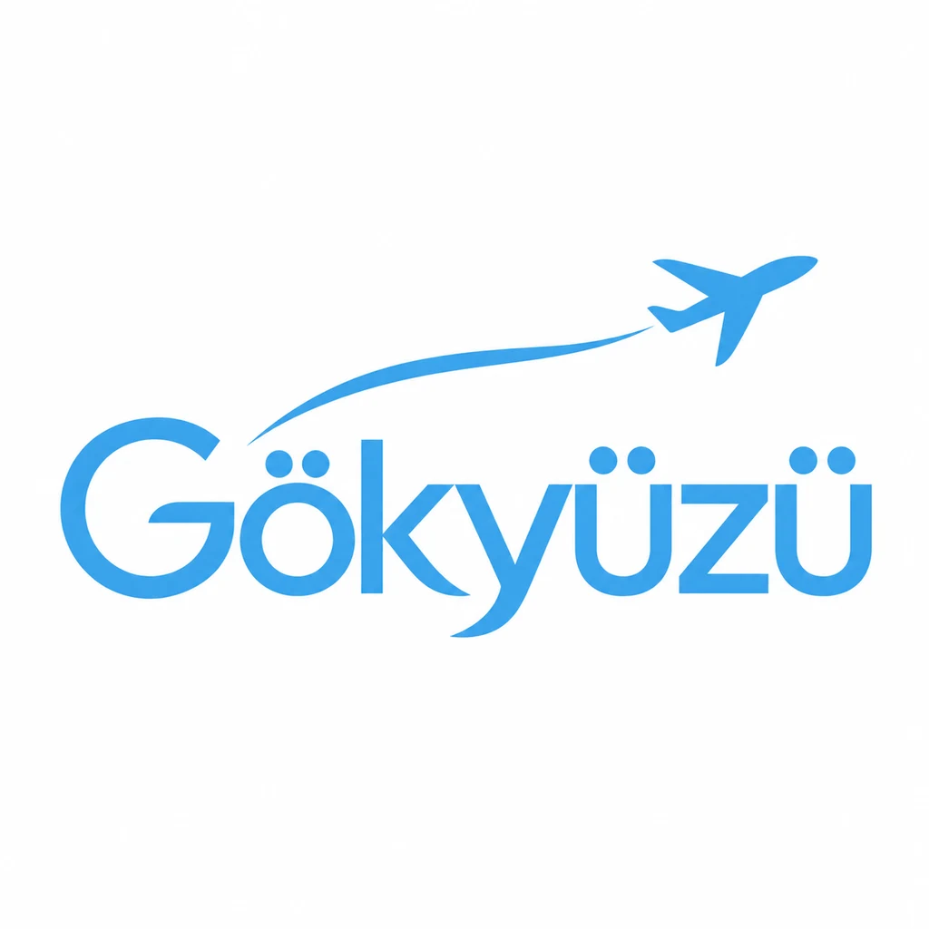
“A clean modern Turkish wordmark for a travel brand called Gökyüzü, umlauts kept clear of the cap height, sky blue on white.”
Three umlauts, all kept clear, and the plane gives it a travel feel. The plane is optional; the wordmark works alone.
What to check in a Turkish logo
- Get the i right. Dotted i and İ, dotless ı and I, are different letters. Check every one, especially in all-caps logos.
- Check the typeface. Make sure it has well-drawn Ş, Ğ and Ç, not marks bolted on afterwards.
- Leave room for the marks. Breves, cedillas and umlauts need space above and below the letters in stacked lockups.
- Mind the domain. Web addresses usually drop Turkish letters. Make sure the plain version still reads as your name.
Naming a Turkish brand
Turkish brand names often use everyday nouns with a warm meaning: Değirmen (mill), Şeker (sugar), Çınar (plane tree). Many include one of the extra letters, which becomes a distinctive detail in the logo.
Making a Turkish logo with Logofai
Describe the business in one sentence and write the name in Turkish exactly as it should be drawn, in quotes if it helps. Name the style you want, such as a calligraphic wordmark, a monogram or a badge, and two or three colors. Each run gives one to four options at 3 credits an image, and you can refine the one you like by describing the change.
Check every letter and mark with a native reader before you use a logo, whichever tool made it. Logofai itself is available in Turkish: see the Logofai homepage in Türkçe. For the general guide to prompts and results, see the AI logo maker.
Good questions.
Why does the dot on the i matter in a Turkish logo?
Turkish has two i letters. The dotted i (capital İ) and the dotless ı (capital I) are different letters, so adding or removing a dot changes the word.
Can I use Turkish letters in my domain name?
Most businesses use a plain version without Ş, Ğ or Ç. Make sure it still reads correctly, and keep the real letters in the logo.
Your name, in your script.
Describe the business and write the name in Turkish. See your first options in a minute.
6 free credits for new accounts, no card required.