


Real estate logos. Eight of them.
A real estate logo is read from a moving car more often than anywhere else. It sits on a yard sign and rider, beside a headshot on a business card, on listing sites next to thousands of other agents and, for most agents, next to a brokerage’s own branding. Below are eight directions for agents, brokerages, property managers and investors, each with the prompt to generate it, and the rules and formats that decide whether a realty mark works.
A real estate logo works when it reads instantly on a yard sign, coexists with brokerage branding, avoids the generic rooftop and stays clean beside a headshot. Yard signs are read from moving cars, so bold shapes, few colors and high contrast matter more than detail. Many US states require an agent’s advertising to include the name of the supervising brokerage, so an individual agent’s logo has to sit comfortably next to the brokerage’s branding; check your state real estate commission’s rules before designing. Almost every agent uses a roof or house icon, so if you use one, make it distinctive, for example an arch framing a door or a porch railing forming a letter. Business cards, listing profiles and social posts pair the logo with a photo, which means a busy mark competes with the face. REALTOR® and the block R logo are trademarks of the National Association of REALTORS®, usable only by members under its rules, and the Equal Housing Opportunity logo is added to advertising separately rather than built into a logo.
Eight marks. And how to ask for them.
Every mark below was generated with Logofai and is shown untouched. Each sits next to a prompt in the same direction, written to start from rather than the original text. Copy one, change the name to yours, and run it.
“A logo for a residential brokerage called Archway Realty Group, a panelled front door inside a brick arch, navy and brass on white, a serif wordmark beneath”
The arch and door deliver exactly what the name promises, and the shape reads on a yard sign. The panel detail on the door is what fills in at rider size.
“A logo for a solo real estate agent called Nora Ellis Homes, an NE monogram under a thin gold roofline, gold on black, a letterspaced serif wordmark beneath”
A monogram under a roofline is the agent formula, done well. Gold on black looks expensive on a card, so keep a one-colour version for signs and riders.
“A logo for a property management company called Bayview Property Management, a four-pane window with a wave in one pane, deep teal on white, a bold wordmark beneath”
A wave in one pane says coastal property management in a single idea, and the square grid crops perfectly to a listing-site avatar.

“A logo for a real estate investment firm called Brick & Beam Investments, stacked bricks rising like a bar chart, brick red and charcoal on white, a serif wordmark beside it”
Bricks rising like a chart is the clearest way to say investment without promising a return. The shapes are heavy enough to survive a small sign.
“A logo for a luxury home brokerage called Lumen Luxury Estates, a letterspaced serif wordmark beneath a thin arc, champagne on black”
The letterspacing is doing the luxury work, not the symbol. That thin arc is the first thing to disappear at small sizes, and the wordmark alone still holds.
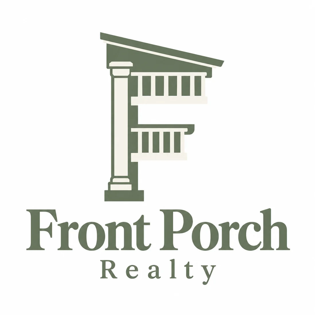
“A logo for a family-owned brokerage called Front Porch Realty, a porch railing and column forming the letter F, sage green on cream, a serif wordmark beneath”
The F is built out of the porch, which is how you escape the generic roofline. Sage and cream read family rather than corporate.
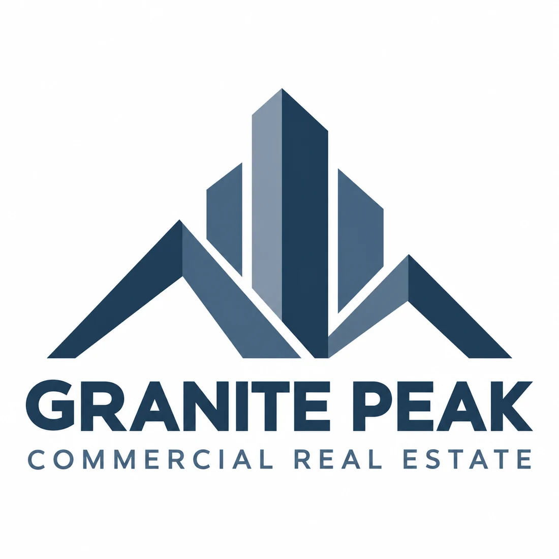
“A logo for a commercial real estate firm called Granite Peak Commercial Real Estate, geometric peaks that double as office towers, steel blue on white, a bold wordmark beneath”
Peaks that double as towers say commercial without resorting to a skyline. It is the most scalable mark on the page and the safest at thumbnail size.
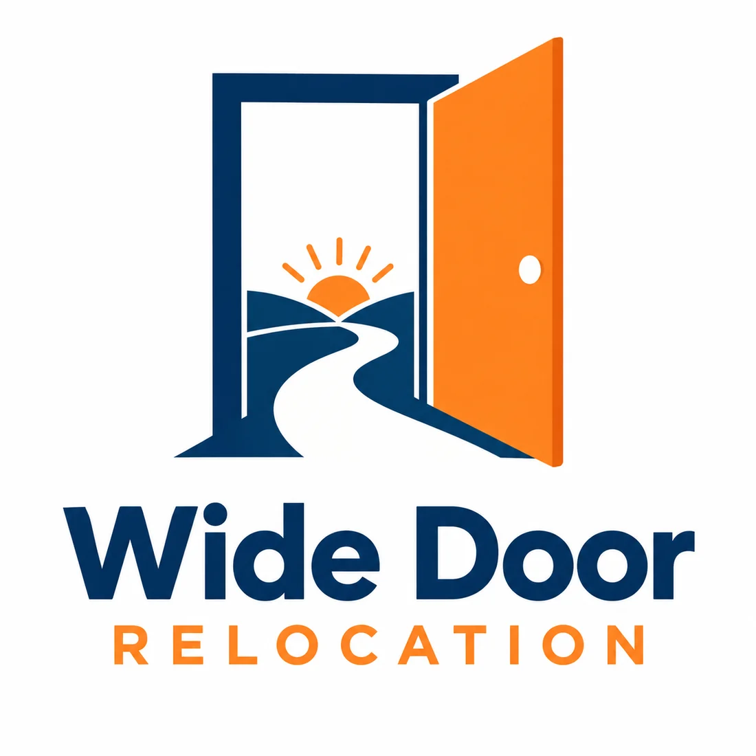
“A logo for a relocation real estate team called Wide Door Relocation, an open door with a path and a sunrise inside it, navy and orange on white, a bold wordmark beneath”
Three ideas in one shape: door, path and sunrise. Orange on navy holds its contrast on a yard sign read from a moving car.
What actually decides it. Four things.
A yard sign is read from a moving car, for a second or two, often from across the street. Fine serifs, thin lines and pale colors disappear at that distance. Use a bold name, a simple shape and strong contrast, and test the logo at the size it will actually appear on the sign and the rider above it. The Archway Realty Group prompt, an arch framing a front door in navy and brass, is the kind of clean shape that holds up there.
Many states require an agent’s advertising to include the name of the supervising brokerage, and many brokerages have their own rules about how an agent’s personal branding may appear. That means an agent’s logo usually has to coexist with the brokerage’s logo on the same sign, card or post. Design it to sit beside another mark without clashing, and check your state real estate commission and your brokerage’s policy before printing anything.
A roof or house outline is the most common symbol in real estate, which means on its own it says only real estate. If you use one, give it a second idea that belongs to you. The Front Porch Realty prompt turns a porch railing into an F, and Bayview Property Management puts a wave inside one window pane. Many strong agent brands skip the house entirely and use a monogram, like the Nora Ellis Homes prompt.
Business cards, listing-site profiles, social posts and email signatures pair the logo with a photo of the agent. A detailed or colorful mark competes with the face and makes the whole card look busy. Keep the logo simple, give it room, and make sure it works in one color, so it can sit quietly in a corner next to a portrait.
This page is part of logo ideas by industry, and its closest neighbours are cleaning logos. If the look matters more than the constraints, see serif logos and monogram logos. When one of these is close, generate a real estate logo with your own name and brokerage in mind.
Where it has to work. The real formats.
| Where | What it demands |
|---|---|
| Yard sign and rider | Read from a moving car. Bold shapes, few colors and high contrast. |
| Business card with headshot | Shares space with a photo, so a busy mark competes with the face. |
| Listing-site profile | A small square or circle beside thousands of other agents. A compact mark reads best. |
| Social posts | Placed over listing photos. Needs a white or reversed version that stays legible. |
| Email signature | Tiny, and often shown with images blocked. Keep a simple wordmark as a fallback. |
Every one of these is a variation, not a resize. Logo System produces each arrangement from one approved mark, with the computed minimum size and clear space, and this guide explains why those numbers matter.
Questions. Answered.
What makes a real estate logo stand out on a yard sign?
Boldness, contrast and restraint. A yard sign is read from a moving car in a second or two, so a heavy, readable name, one simple shape and two strong colors beat any amount of detail. Avoid thin serifs, pale colors and small taglines inside the logo itself. Put the phone number and website on the sign separately, and test the logo at real sign size from across a street before ordering a batch.
Does an agent’s logo need the brokerage name?
Often, on the advertising where the logo appears. Many US states require an agent’s ads, signs and marketing to include the name of the supervising brokerage, and many brokerages set their own rules for how an agent’s personal brand can be shown. The requirement is usually about the advertisement rather than the logo file itself, so check your state real estate commission’s rules and your brokerage’s policy, and design your logo to sit comfortably beside the brokerage’s branding.
Should a real estate logo use a house or roof icon?
It can, but on its own it will look like everyone else’s. A house or roofline is the most common symbol in the industry, so if you use one, add a second idea that is specific to you, such as a door, a porch or a local landmark, or skip the house and use a monogram or a strong wordmark. Keep REALTOR® and the block R logo out of your design unless you are a member following the National Association of REALTORS® rules, since both are its trademarks.
More industries: law firms, contractors, consulting firms, accountants, bars, cleaning companies, musicians and bands, churches and ministries, nonprofits and charities, beauty and cosmetics, security companies, restaurants, medical and dental, jewelers, logistics and trucking, spas and wellness.
Your name, your prompt.
Or have your current logo scored on seven dimensions.
Running a small business? The small business logo maker shows logos for every kind of local company.