
Security logos. Eight of them.
The word security covers two businesses that look nothing alike. A cybersecurity firm lives in dark dashboards, pitch decks and threat reports; a guarding company lives on uniform patches, patrol cars and site signage. Both need to look authoritative, and both are tempted by the same shield and padlock. Below are eight directions, four for cybersecurity and four for physical security, each with the prompt to generate it, and the constraints that decide whether a security mark works, including why it must never look like a police badge.
A security company logo works when it looks authoritative without impersonating law enforcement, reproduces boldly on uniforms and vehicles, and, for cybersecurity, holds up on dark interfaces while saying something more specific than a padlock. Shields are a legitimate and widely used symbol for protection. Police-style badges, stars, government seals and anything resembling official insignia are a legal risk: many jurisdictions restrict licensed private security firms from looking official, and uniforms or vehicles that could be mistaken for police can breach licensing rules. Physical security marks get embroidered on patches and applied to cars, so they need heavy shapes, few colours and a short name. Cybersecurity marks live on near-black dashboards, reports and app icons, where electric blue, teal and green read clearly and a compact symbol matters more than the wordmark. Because nearly every cyber startup reaches for a padlock or a shield, the brands that get remembered build their symbol from something more specific to what they do.
Eight marks. And how to ask for them.
Every mark below was generated with Logofai and is shown untouched. Each sits next to a prompt in the same direction, written to start from rather than the original text. Copy one, change the name to yours, and run it.
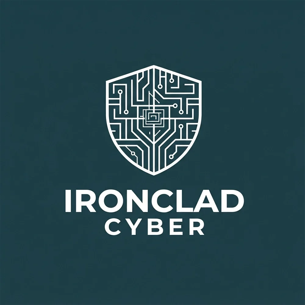
“A logo for a cybersecurity consultancy called Ironclad Cyber, a shield drawn from circuit traces, white on dark teal, a bold uppercase wordmark beneath”
Shield plus circuitry is the category default, drawn about as well as it can be. The traces are the first thing to go at favicon size, leaving a plain shield.
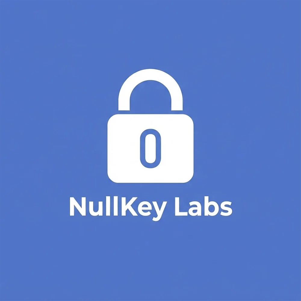
“A logo for a penetration testing firm called NullKey Labs, a padlock whose body carries a zero, white on cornflower blue, a bold sans wordmark beneath”
The zero inside the lock is the specific idea, and it survives being shrunk to a dashboard icon. Blue is friendlier than the neon green asked for.
“A logo for an encryption software company called KeyBrace, a key standing between two angle brackets, white on tan, a bold uppercase wordmark beneath”
Code brackets plus a key says encryption software rather than security in general, which is exactly the point the page argues.
“A logo for a managed security operations centre called Quietline SOC, a pulse spike settling into a flat line, black on acid yellow, a rounded sans wordmark beside it”
It says calm monitoring rather than generic protection, and it is the only mark here with no shield and no lock. It reproduces in one color perfectly.
“A logo for a security guard company called Stoutgate Guard Services, a heavy shield carrying a stylised S, black on pink, a bold uppercase wordmark beneath”
The shield is right for guarding and looks nothing like a police badge, which is the legal line that matters. The pink is the odd note: navy or silver would suit uniforms and patrol cars better.
“A logo for a mobile patrol service called Nightwatch Patrol, an owl’s face inside a hexagon, cream on brick red, a two-weight wordmark beneath”
The owl carries the night-watch idea better than an eye would, and the hexagon crops well to a shoulder patch. Keep it to two colors for embroidery.
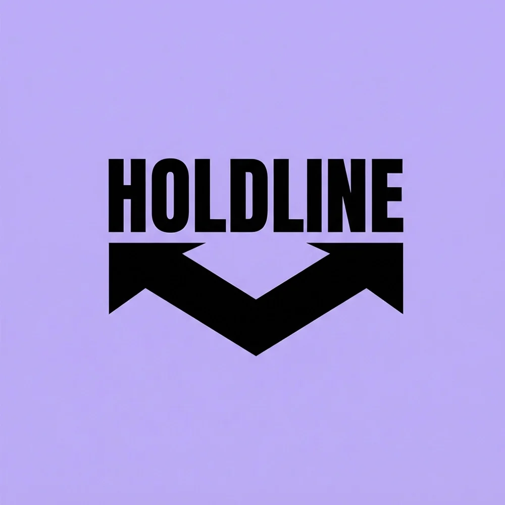
“A logo for a crowd management company called Holdline Event Security, a heavy condensed wordmark over a chevron, black on lavender”
Heavy enough for a hi-vis vest and a barricade, which is where this business puts its name. The chevron doubles as a crowd-flow arrow.
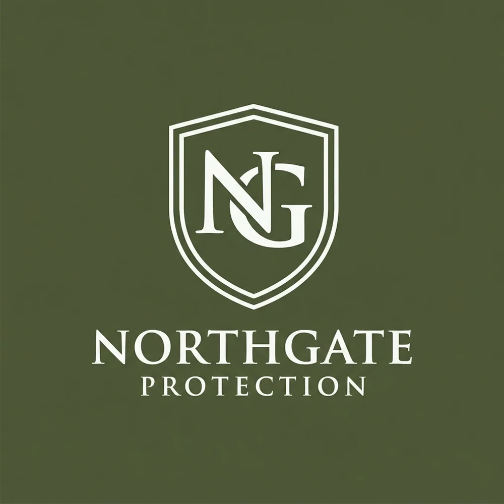
“A logo for a close protection firm called Northgate Protection, an NG monogram inside a thin shield, white on olive, a letterspaced serif wordmark beneath”
The serif and the thin shield read as discreet rather than tactical, which suits close protection. Thin outlines are the thing to check on a patch.
What actually decides it. Four things.
Shields work, and clients read them instantly as protection. What does not work is anything that could be mistaken for law enforcement: police-style badges, stars, crests that resemble a government seal, or colour schemes that echo the local police. In many places licensing rules restrict private security firms from looking official, and the risk falls on the company, not the designer. The Stoutgate Guard Services prompt asks explicitly for a shield with nothing resembling a police badge, and that instruction belongs in every guarding prompt you write.
A guarding logo is embroidered on shoulder patches, printed on high-visibility vests and applied to patrol cars. Embroidery cannot hold fine lines or small text, and vehicle graphics are read at a distance and at speed. Keep the shape heavy, use two or three colours at most, and make sure the company name is short enough to read on a car door. The Holdline Event Security prompt, a bold condensed wordmark in black and yellow, is built for exactly that environment.
Almost every cybersecurity company uses a padlock, a shield or a keyhole, so on their own they say only that you work in security. The marks that get remembered add something specific. The NullKey Labs prompt turns the keyhole into a zero, KeyBrace builds a key from code brackets, and Quietline SOC uses a pulse line settling flat, which says calm monitoring rather than generic protection. Keep the familiar symbol if it helps, but give it one idea that belongs only to you.
Cybersecurity products and reports live on near-black backgrounds: dashboards, terminal-style consoles, dark-mode apps and threat reports. A navy mark on black disappears, and thin lines lose contrast. Test every direction reversed on near-black and at app-icon size. Electric blue, teal, green and white hold up well on dark screens, and a compact symbol is worth more than a wordmark once the logo shrinks to a sidebar icon.
This page is part of logo ideas by industry, and its closest neighbours are consulting firm logos. If the look matters more than the constraints, see geometric logos and emblem logos. For your own firm, take the closest prompt and generate a logo with your company name in it.
Where it has to work. The real formats.
| Where | What it demands |
|---|---|
| Uniform patch | Embroidered at a few centimetres wide. Thread cannot hold hairlines or small lettering. |
| Vehicle livery | Read at a distance and at speed, and must not resemble police markings or colours. |
| Dashboard and app icon | Near-black backgrounds at tiny sizes. A compact symbol with strong contrast is essential. |
| Security reports | Printed or exported to PDF, often in greyscale. The mark needs a one-colour version. |
| Website header | Needs a horizontal lockup that reads as credible in a narrow navigation bar. |
Every one of these is a variation, not a resize. Logo System produces each arrangement from one approved mark, with the computed minimum size and clear space, and this guide explains why those numbers matter.
Questions. Answered.
Can a security company logo use a badge or shield?
A shield, yes. It is one of the clearest symbols for protection and is widely used by private security firms. A badge is a different matter. Anything resembling a police badge, a law-enforcement star or a government seal can breach the rules that govern licensed security companies in many places, which often restrict private firms from looking official. Keep shields simple, avoid stars, crests and official-looking wording, and check your local licensing requirements before printing uniforms or vehicle graphics.
What makes a cybersecurity logo look modern?
Specificity and restraint. A modern cyber mark usually has one compact symbol carrying a single idea, a clean sans-serif wordmark and a palette that reads well on dark screens, such as electric blue, teal, green or white on near-black. What dates a cybersecurity logo fastest is the generic kit: a padlock, a globe, binary digits and a gradient all at once. Keep the familiar symbol if you want it, but turn it into something only your company would use.
Will the logo embroider well on uniforms?
Only if it is designed with thread in mind. Embroidery on a shoulder patch or a cap is a few centimetres wide, so fine lines, small text and gradients either disappear or turn into a blur of stitches. Bold shapes, two or three solid colours and a short name embroider cleanly. Ask your embroiderer for a stitch proof before ordering in bulk, and keep a simplified patch version of the logo separate from the version you use on the website.
More industries: law firms, contractors, consulting firms, accountants, bars, cleaning companies, real estate agents, musicians and bands, churches and ministries, nonprofits and charities, beauty and cosmetics, restaurants, medical and dental, jewelers, logistics and trucking, spas and wellness.
Your name, your prompt.
Or have your current logo scored on seven dimensions.
Running a small business? The small business logo maker shows logos for every kind of local company.