


Church logos. Eight of them.
A church logo is read by two very different people: the member who has walked through the doors for thirty years and the newcomer deciding whether to walk through them at all. It lands on a photocopied bulletin, a projector slide over a worship photo, a livestream overlay and an embroidered volunteer shirt, and rarely in full colour. Below are eight directions for parishes, contemporary churches and ministries, each with the prompt to generate it, and the formats that actually decide whether a church mark works.
A church logo works when it feels welcoming rather than corporate, survives one-colour printing on bulletins and signs, uses religious symbols deliberately, and stays legible when projected or overlaid on a livestream. The recurring structures are a cross or other symbol paired with the church name, a simple emblem built from something local such as a lighthouse, a table or a sunrise, and a plain wordmark for congregations that prefer understatement. Crosses, doves, flames and water each carry meaning, and some carry denominational weight, so use one symbol simply rather than combining several. Colour matters less than people expect, because so much church material is printed in black or a single colour, which makes contrast and a clear silhouette the real test. Deep blues, greens, burgundy and warm neutrals remain common, while youth and children’s ministries often use brighter colour to signal energy.
Eight marks. And how to ask for them.
Every mark below was generated with Logofai and is shown untouched. Each sits next to a prompt in the same direction, written to start from rather than the original text. Copy one, change the name to yours, and run it.
“A logo for a coastal community church called Grace Harbor Church, a lighthouse casting its beam over waves, white on navy, a letterspaced serif wordmark beneath”
The cross the brief asked for never appeared in the beam, so this reads as coastal and welcoming rather than explicitly Christian. That is fine on a building that already says church.
“A logo for a traditional Catholic parish called St. Brendan’s Parish, a Celtic knot cross inside a ring, burgundy on pale lilac, a classic serif wordmark beneath”
Exactly what a parish expects. The knotwork is the risk: those interlaces close up on a photocopied bulletin and on an embroidered shirt.
“A logo for an outreach ministry called Living Water Ministries, a water droplet holding a cross above a wave, black on light blue, a rounded sans wordmark beneath”
It came back flat rather than the gradient in the brief, which is better: the cross survives a photocopier.
“A logo for a church youth group called Cornerstone Youth, a keystone block with a brushed cross cut out of it, charcoal on cream, a bold wordmark with a brush-script second line”
The keystone names the group without a word. Charcoal on cream is calmer than the bright orange asked for, so it reads a little older than a youth ministry might want.
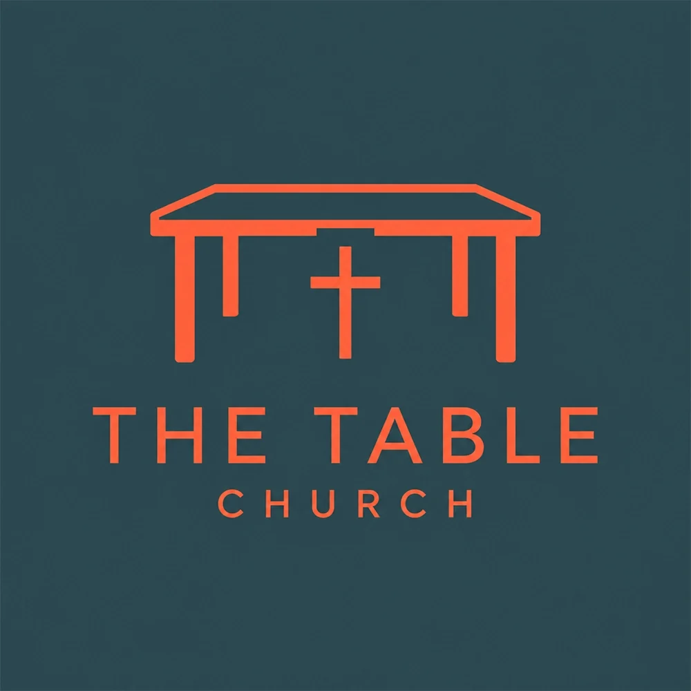
“A logo for a house church network called The Table Church, a single-line table with a small cross between its legs, terracotta on dark teal, a letterspaced wordmark beneath”
One of the strongest ideas across these pages. The symbol says gathering rather than religion in general, and the cross is found inside the furniture.
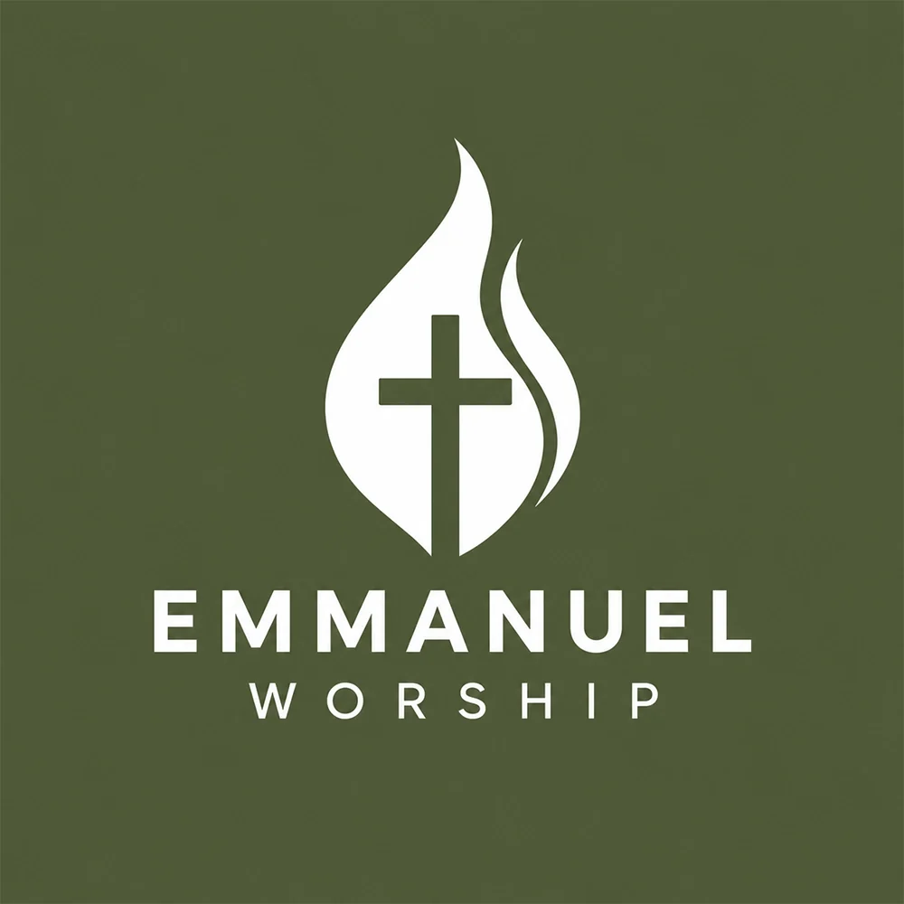
“A logo for a worship band ministry called Emmanuel Worship, a flame with a cross at its heart, white on olive green, a letterspaced sans wordmark beneath”
Compact and high contrast, which is what a livestream overlay and a projector slide need. One color means it reverses out cleanly.
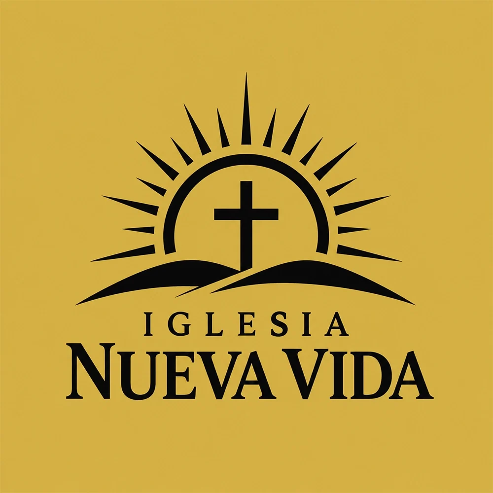
“A logo for a Spanish-speaking church called Iglesia Nueva Vida, a cross on a hill in front of a rising sun, black on gold, a serif wordmark beneath”
The rays are the detail to watch: on a one-colour bulletin they thicken and the sun turns into a solid block.
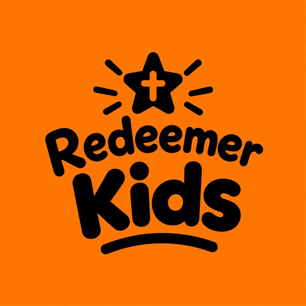
“A logo for a children’s ministry called Redeemer Kids, a playful rounded wordmark with a star cross above it, black on bright orange”
Reads as a children’s ministry instantly. The hand-drawn underline and star are fine in print and the first things to blur in a slide corner.
What actually decides it. Four things.
A newcomer should feel invited, not marketed to. Glossy gradients, sharp tech-style monograms and slogan-heavy lockups can make a church read like a product launch, which is the opposite of the first impression most congregations want. Warmth usually comes from simple shapes, readable type and a symbol with local meaning. Grace Harbor Church uses a lighthouse over waves and The Table Church a single-line table, and both say something specific about that community rather than about branding.
Bulletins, hymn sheets, event flyers and notice boards are often printed in black or photocopied, and exterior signs are frequently a single colour cut from vinyl or metal. A mark that relies on a gradient or two overlapping tints will lose its idea on the first photocopier. Check every direction as a flat black shape before choosing. Living Water Ministries was asked for a blue gradient and came back flat, which is why its cross still survives a photocopier.
Crosses, doves, flames, water and olive branches are not decoration. They carry theological meaning, and some forms carry denominational associations: a Celtic cross reads differently from a plain Latin cross, and a flame and cross together read differently again. Choose one symbol that says something true about your church and draw it simply. Stacking a cross, a dove and a flame into one mark usually weakens all three, and it becomes unreadable at bulletin size.
Many churches now show their logo more often on a screen than on paper: welcome slides, lyric backgrounds, sermon title cards and livestream overlays. Those sit on top of photography and video, so a thin or low-contrast mark vanishes. Keep a version that works reversed out in white, and a version with a subtle backing shape if your slides are busy. The Emmanuel Worship prompt, a flame and cross merged into one shape, is the kind of compact mark that holds up over moving video.
This page is part of logo ideas by industry, and its closest neighbours are nonprofit logos. If the look matters more than the constraints, see serif logos and emblem logos. To turn one of these prompts into your own church’s mark, make a logo with AI and change the name to yours.
Where it has to work. The real formats.
| Where | What it demands |
|---|---|
| Exterior sign | Read from a car or across a car park, often in one colour cut from vinyl or metal. Detail disappears first. |
| Printed bulletin | Usually black and white, sometimes photocopied. Thin lines and pale tints do not survive. |
| Projector slide | Sits over worship photography and lyrics, so it needs a reversed-out white version and strong contrast. |
| Livestream overlay | A small corner mark over moving video. Compact symbols work; long names shrink to nothing. |
| Embroidered volunteer shirt | Thread cannot hold hairlines or tiny text. Keep the shapes bold and the letters large. |
Every one of these is a variation, not a resize. Logo System produces each arrangement from one approved mark, with the computed minimum size and clear space, and this guide explains why those numbers matter.
Questions. Answered.
Should a church logo include a cross?
It does not have to. A cross tells people instantly that you are a Christian church, which is valuable on a sign or a search result, but it is also the one symbol every church shares, so on its own it does little to distinguish yours. Many strong church marks either build the cross from something local, a lighthouse, a table or a sunrise, or leave the symbol out and let the name and a warm, readable typeface do the work. Whatever you choose, draw it simply enough to print on a bulletin.
What colours work for a church logo?
Deep blues, greens, burgundy, warm neutrals and gold are the most common because they read as steady and welcoming, while youth and children’s ministries often choose brighter colour to signal energy. Liturgical colours carry meaning in some traditions, so check what yours implies. In practice the colour matters less than the contrast, because so much church material is printed in black or a single colour, projected over photos, or embroidered. Pick colours that still work when the logo is flattened to one.
Does a church logo need to work in one colour?
Yes, and it is the single most useful test. Bulletins, hymn sheets and flyers are often printed in black or photocopied, exterior signs are frequently one colour, and embroidery on volunteer shirts turns gradients into flat thread. Keep a one-colour black version and a reversed white version of the mark from the start. If the symbol loses its meaning in one colour, as a gradient water droplet can, simplify the drawing rather than hoping every printer reproduces the colour.
More industries: law firms, contractors, consulting firms, accountants, bars, cleaning companies, real estate agents, musicians and bands, nonprofits and charities, beauty and cosmetics, security companies, restaurants, medical and dental, jewelers, logistics and trucking, spas and wellness.
Your name, your prompt.
Or have your current logo scored on seven dimensions.
Running a small business? The small business logo maker shows logos for every kind of local company.