


Music logos. Eight of them.
A music logo has a harder life than most. It is cropped to a circle on every streaming profile, screen-printed in one colour on a merch table, shrunk to an avatar beside a hundred other artists, and it still has to tell a stranger what the music sounds like before they press play. Below are eight logo directions for bands, solo artists, labels and studios, each with the prompt to generate it, and a section on the formats that decide whether a music mark survives.
A music logo has to do four jobs at once: survive a circle crop on Spotify, Apple Music and social profiles, print in one or two flat colours on screen-printed merch, stay recognisable as a 40 pixel avatar, and signal genre at a glance. Typography does most of that last job. Blackletter and sharp symmetry read as metal, a flowing script reads as R&B or soul, a condensed bold wordmark reads as electronic and club music, and hand-drawn or woodcut marks read as folk and indie. Solo artists usually need their name as the mark, because listeners search for a person. Labels, studios and collectives benefit more from a symbol, because it has to sit on sleeves, spines and vinyl centre labels without the full name. Whatever the genre, test the mark inside a circle and in a single colour before committing, since those two formats are where most music logos quietly fail.
Eight marks. And how to ask for them.
Every mark below was generated with Logofai and is shown untouched. Each sits next to a prompt in the same direction, written to start from rather than the original text. Copy one, change the name to yours, and run it.
“A logo for an indie folk record label called Hollow Pines Records, a black vinyl record with a burst of light breaking out of the groove, black on lime yellow, a bold uppercase wordmark beneath”
The pine tree in the brief never appeared, so the record does all the work. It flattens to one color well, but the name is carrying the folk part alone.
“A logo for a solo R&B singer called Kora Vale, a bold letter V with a vintage microphone standing inside it, black on sage gray, a heavy sans wordmark beneath”
A microphone instead of the script ribbon asked for. It reads as a singer instantly, though a vintage mic leans more soul and jazz than modern R&B.
“A logo for a shoegaze band called Static Bloom, a treble clef drawn as a curling flower stem, white on bright orange, a bold sans wordmark beside it”
The blur is gone and a treble clef is generic to music rather than specific to the band, but it survives a circle crop and one color cleanly.
“A logo for a recording studio called Low Tide Sound, a face in profile whose hair becomes a treble clef, black on rust orange, a bold sans wordmark beneath”
No wave and no VU meter: this is a singer, which suits a vocal studio more than a mixing room. At avatar size the face and the clef merge into one shape.
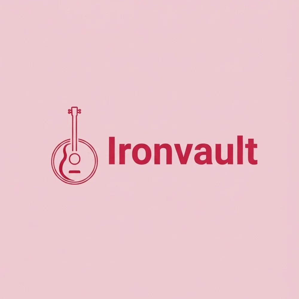
“A logo for a heavy metal band called Ironvault, a finely drawn banjo beside a red wordmark, deep red on blush pink”
The clearest miss on these pages: a banjo and blush pink for a metal band. It is kept as the warning the page makes in its third rule, because the prompt named the genre but not the instruments or the weight.
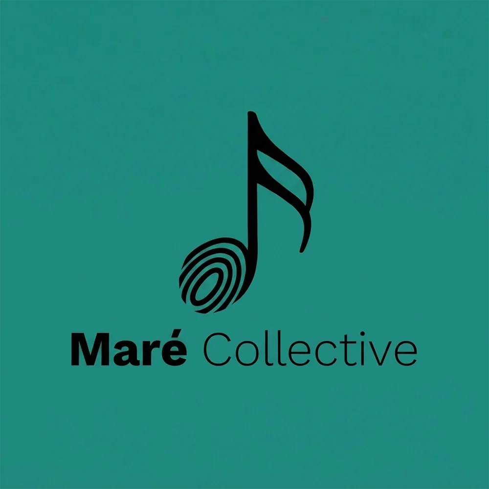
“A logo for a jazz ensemble called Maré Collective, a music note whose head is a fingerprint, black on teal, a two-weight sans wordmark beneath”
The fingerprint is a better idea than the monogram asked for, and the note keeps it unmistakably musical. The ridges are the part that fills in on merch.
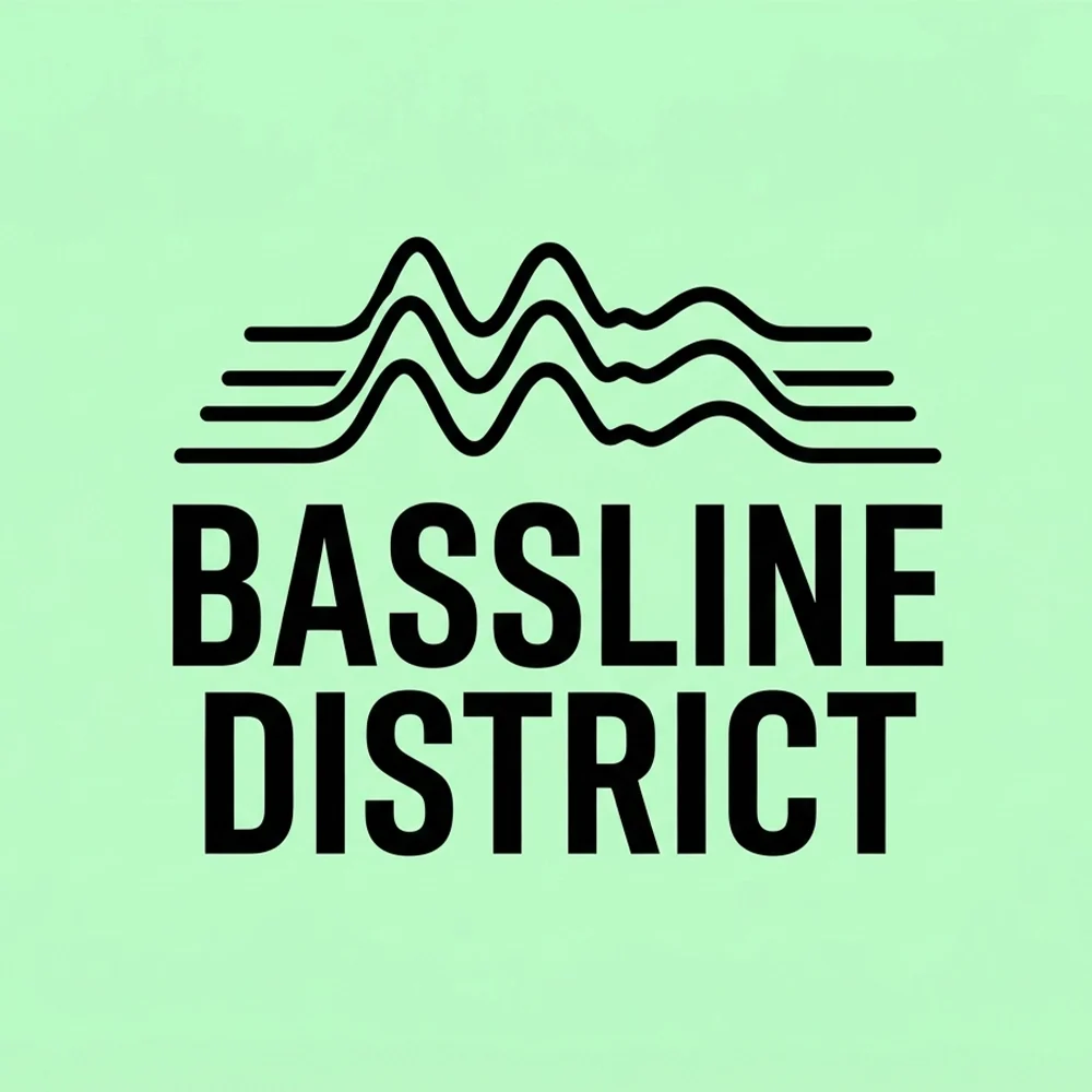
“A logo for a drum and bass DJ called Bassline District, a stacked waveform above a heavy condensed wordmark, black on mint green”
The closest match to its prompt here, and the most reproducible: two flat shapes, no gradient, legible small.
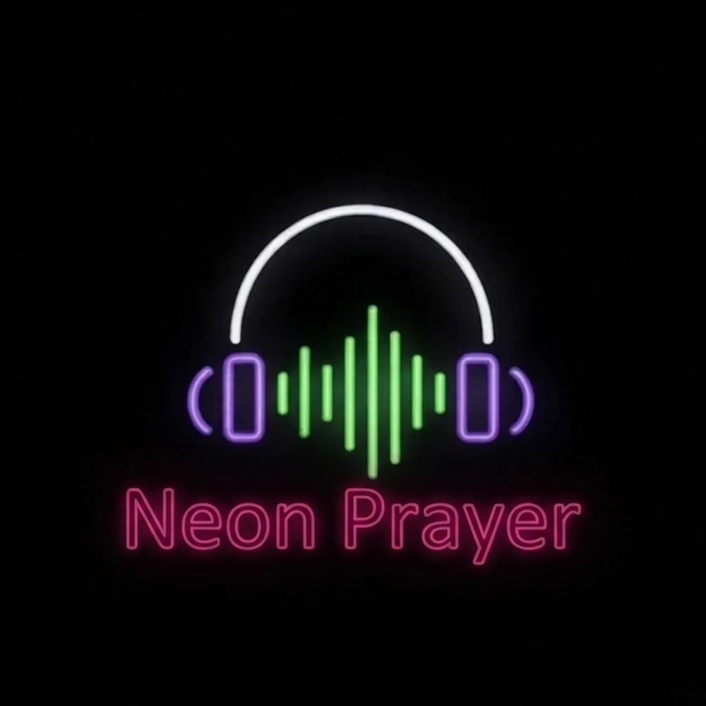
“A logo for a synthwave producer called Neon Prayer, glowing neon headphones around an equalizer, purple and green on black, a soft neon wordmark beneath”
The glow is the whole idea, which makes it the least portable mark on the page. It needs a flat version for merch, stickers and anything printed.
What actually decides it. Four things.
Spotify, Apple Music, YouTube and every social platform crop the artist image to a circle, and the logo usually ends up inside that crop too. A long horizontal wordmark shrinks to a thin stripe across the middle; a square emblem loses its corners. Before you choose a direction, draw a circle over it. If the mark does not survive, plan a compact version, an initial or a symbol, that does. Bassline District and Maré Collective below both hold their shape inside a square. Ironvault, a wide line drawing of a banjo, would need a compact version drawn for it.
Most band T-shirts, tote bags and posters are screen-printed, and each extra colour is another screen and another charge on the print run. Gradients do not screen-print without halftoning, and fine detail fills in on cheap fabric. A music logo that only works in full colour will be redrawn by whoever prints your first run, usually badly. Check your mark as a flat one-colour silhouette, and treat a glowing version, like the neon headphones in Neon Prayer below, as a digital extra rather than the master.
A metal logo and a folk logo should never be mistaken for each other, and type does most of that work. Blackletter and sharp symmetry say heavy music; a flowing script says R&B or soul; a condensed bold wordmark over a waveform says drum and bass; woodcut texture and hand drawing say folk and indie. Borrowing the conventions of your genre is not a failure of originality. It is how a listener scrolling a festival line-up knows in a second whether you are for them. Just never borrow a real band’s logo, however typical of the genre it looks.
Solo artists and bands are searched by name, so the name usually leads, as in Kora Vale and Static Bloom below, each of which adds a single symbol to the wordmark. Labels, studios and schools face a different job: the mark sits on sleeves, spines, the corner of album art and a vinyl centre label, often without room for the full name. A symbol earns its place there. Hollow Pines Records is a record with light breaking out of the groove; Low Tide Sound builds a face and a treble clef into one silhouette. Either can stand alone once people know it.
This page is part of logo ideas by industry, and its closest neighbours are bar logos. If the look matters more than the constraints, see hand-drawn logos and bold logos. To turn one of these prompts into your own mark, make a band logo with AI and swap in your name.
Where it has to work. The real formats.
| Where | What it demands |
|---|---|
| Streaming profile | Cropped to a circle on Spotify, Apple Music and YouTube. Corners and long wordmarks are the first casualties. |
| Album artwork corner | Sits small over busy photography or illustration, so it needs contrast and a clear silhouette. |
| One-colour merch print | Screen printing charges per colour and cannot print a gradient. Fine lines fill in on fabric. |
| Vinyl centre label | A small circle with a spindle hole in the middle. Symbols survive; long names wrap awkwardly. |
| Social avatar at 40px | Smaller than a thumbnail. Only a compact symbol or one or two letters stays readable. |
Every one of these is a variation, not a resize. Logo System produces each arrangement from one approved mark, with the computed minimum size and clear space, and this guide explains why those numbers matter.
Questions. Answered.
Should a band logo be a wordmark or a symbol?
Start with a wordmark. Listeners search for bands and artists by name, and a new act has not yet earned a symbol that people recognise on its own. Add a compact symbol or initial alongside it for the places a name will not fit: the streaming circle, a small avatar, a guitar pick or a sticker. Labels, studios and collectives are the exception. Their mark sits on other artists’ releases, so a strong symbol is worth more to them than a long name.
What size does a music logo need to work at?
Smaller than you think. A social avatar is around 40 pixels across, a streaming profile photo is cropped to a circle not much larger on a phone, and a logo in the corner of album art is often under a centimetre in print. Test the mark at 40 pixels and inside a circle. If the name turns into a smudge, keep a compact version, a single initial or the symbol alone, for small placements, and save the full wordmark for posters, merch and headers.
What files do I need to print merch?
A vector file, usually SVG, EPS or PDF, so the printer can scale the design to a shirt or a banner without blurring, plus a one-colour version for screen printing, since each colour is a separate screen. Printers also appreciate a version with a transparent background and your colours written down as exact values. On Logofai, SVG export is available on any subscription, and transparent-background PNGs are included on the Pro and Business plans.
More industries: law firms, contractors, consulting firms, accountants, bars, cleaning companies, real estate agents, churches and ministries, nonprofits and charities, beauty and cosmetics, security companies, restaurants, medical and dental, jewelers, logistics and trucking, spas and wellness.
Your name, your prompt.
Or have your current logo scored on seven dimensions.
Running a small business? The small business logo maker shows logos for every kind of local company.