


Beauty logos. Eight of them.
A beauty logo spends most of its life smaller than a thumbnail: on the lid of a lip tint, the neck of a dropper bottle, a two-centimetre label on a tube. It also has to hold a gold foil on a gift box, stand out on a shelf beside dozens of competitors, and tell a shopper in a glance whether the brand is luxury, clean, playful or clinical. Below are eight directions for skincare, makeup, salons and a barbershop, each with the prompt to generate it, and the formats that decide whether a beauty mark survives packaging.
A beauty or cosmetics logo works when it stays legible on tiny packaging, holds fine lines in gold foil and embossing, stands out on a crowded shelf and uses typography to signal positioning. Packaging comes first, because most cosmetics labels are only a few centimetres wide and a lid or dropper can be under two. Type does most of the positioning work: a high-contrast serif reads as luxury, a lowercase sans reads as clean and modern, a script reads as feminine or artisanal, and bubble letters read as playful and young. Symbols are usually small and simple, a sunburst, a leaf, a flower or a single stroke, because detail disappears at packaging sizes. Premium brands favour black, gold, cream and blush, clean skincare favours soft neutrals and greens, and brands aimed at a younger audience use saturated pinks and oranges. Check every mark at two centimetres wide and as a one-colour foil before committing.
Eight marks. And how to ask for them.
Every mark below was generated with Logofai and is shown untouched. Each sits next to a prompt in the same direction, written to start from rather than the original text. Copy one, change the name to yours, and run it.
“A logo for a clean skincare brand called Lumière Skin, a single-line face in profile with a leaf sprig, black on cream, an elegant serif wordmark beneath”
The sunburst became a leaf and a face. It is pretty, and it is also the most common line-art formula in skincare, so the typography is doing the differentiating.
“A logo for a vegan makeup brand called Velvet & Vine, a letter V holding a face in profile, white on deep teal, a serif wordmark beneath”
The leaf flourish never appeared, so nothing in the mark says vegan or botanical. The V and face pairing is strong; the story has to come from the packaging.
“A logo for a hair salon called Studio Kaia, a cluster of makeup brushes, lipstick and a compact mirror, pink on deep purple, a bold uppercase wordmark beneath”
It says cosmetics counter, not hair salon: no scissors and no monogram. A salon using this would advertise the wrong service, the same trap the contractor page shows with the wrong tool.
“A logo for an inclusive foundation brand called Nude Theory, a line-drawn face inside a peach gradient circle, white wordmark beneath, warm gray background”
The five skin-tone dots are missing, and they were the whole idea: one glance said inclusive shade range. Without them this is a generic beauty avatar.
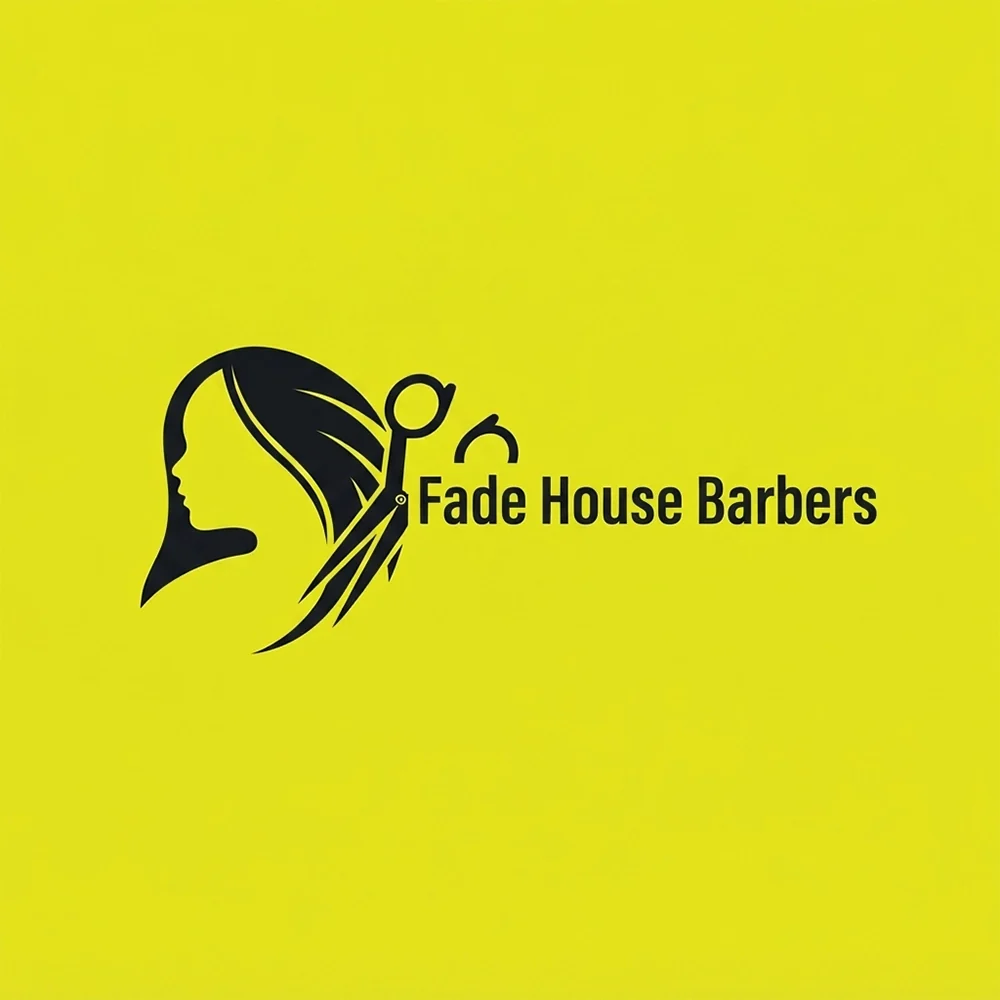
“A logo for a barbershop called Fade House Barbers, a face with flowing hair and a pair of scissors, black on lime yellow, a bold sans wordmark beside it”
Reads as a hair salon rather than a barbershop, where the conventions are razors, poles and heavier type. The lime background is unusually loud for the category too.
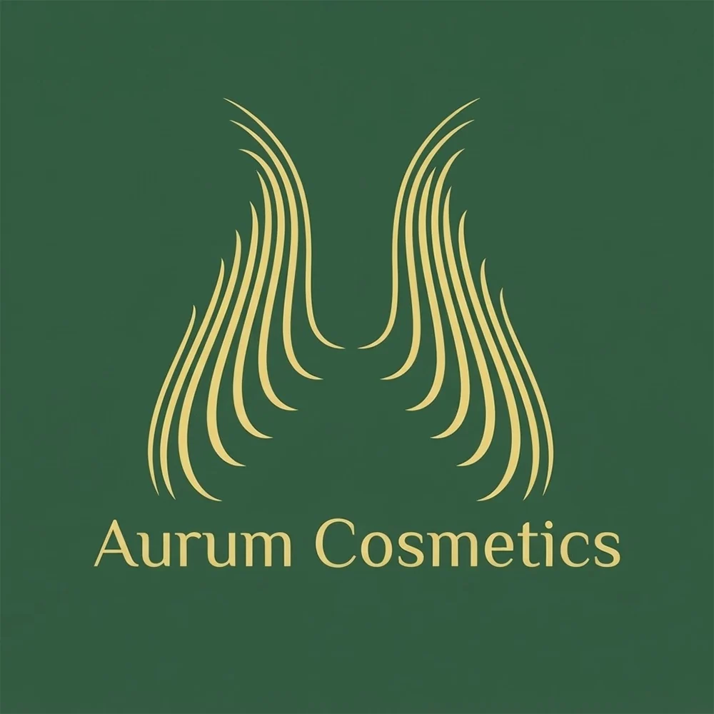
“A logo for a luxury makeup brand called Aurum Cosmetics, symmetrical gold strands like hair or wings, gold on forest green, a light serif wordmark beneath”
The serif alone would have looked more expensive. Fine gold strands are exactly the detail that breaks up in foil stamping on a small box.
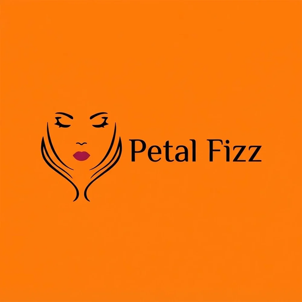
“A logo for a Gen Z lip tint brand called Petal Fizz, a line-drawn face with bold red lips, black and red on bright orange, a light wordmark beside it”
The bubble letters in the brief would have carried the playful tone; this is more restrained than the name promises. The lips at least name the product.
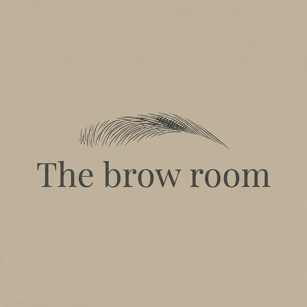
“A logo for a brow studio called The Brow Room, a finely drawn eyebrow above a serif wordmark, dark gray on taupe”
The most specific mark on the page: it names the service in one shape. The individual hairs are far too fine for embroidery, so keep a simplified version for uniforms.
What actually decides it. Four things.
Most of a cosmetics brand’s impressions happen on the product itself: tubes, droppers, compacts and lids, often under two centimetres wide. A detailed emblem or a long wordmark shrinks into a smudge at that size. Plan two versions from the start: the full logo for boxes, signage and the website, and a compact mark, a monogram or a symbol, for lids and small labels. The Brow Room reduces to a single brow, which survives on a lid. Studio Kaia went the other way, a cluster of small objects, and it will not.
Premium packaging often uses hot-foil stamping or blind embossing, and both have physical limits. Very thin hairlines break up in foil and disappear in an emboss, and tiny counters inside letters fill in. Aurum Cosmetics came back as a fan of fine gold strands, and hairlines like those are exactly what foil breaks up. Its serif wordmark is the part that will hold. Ask your printer for their minimum line weight before finalising, and check the logo at the size it will actually be foiled.
In a shop or a marketplace grid, your logo sits beside dozens of competitors, many of them using the same black-and-gold or blush-and-cream formula. Blending in reads as generic. Standing out usually comes from one committed choice rather than many: a colour nobody near you uses, a distinctive letterform, or a symbol that is genuinely yours. Nude Theory was meant to carry a row of five skin-tone dots, which would have said inclusive shade range in one glance. They never arrived, and without them the mark is another line-drawn face.
Before any symbol, typography tells a shopper what kind of brand this is. A high-contrast serif signals luxury and heritage, a clean lowercase sans signals modern and minimal, a script signals feminine, handmade or indulgent, and rounded bubble letters signal playful and young. Decide the position first, then choose the type that says it. Mixing a luxury serif with bubbly colours sends two messages at once, and the shopper believes neither. And whatever you choose, keep clear of any resemblance to a luxury house’s monogram.
This page is part of logo ideas by industry, and its closest neighbours are spa and wellness logos. If the look matters more than the constraints, see elegant logos, script logos and luxury logos. When one of these is close to your brand, run it through Logofai’s AI logo maker with your own name in place.
Where it has to work. The real formats.
| Where | What it demands |
|---|---|
| Product labels | Often under two centimetres wide on lids, tubes and droppers. A compact mark is essential. |
| Outer boxes | Frequently foil-stamped or embossed, which breaks up hairlines and fills in small counters. |
| Salon signage | Read from the street and through glass. Needs contrast and a name that is legible at a distance. |
| Instagram avatar | A small circle beside every post and story. Monograms and simple symbols hold; long names do not. |
| Gift cards | Printed small, often in one metallic colour on a plain card. Shape and spacing do the work. |
Every one of these is a variation, not a resize. Logo System produces each arrangement from one approved mark, with the computed minimum size and clear space, and this guide explains why those numbers matter.
Questions. Answered.
What makes a cosmetics logo look premium?
Restraint, spacing and type, far more than gold. A high-contrast serif with generous letter-spacing, a limited palette and plenty of empty space around the mark read as expensive, while busy ornament and several colours read as cheap. Gold works when it is the only accent, as a foil on black or cream. Check that the finest strokes are heavy enough to survive foil stamping, because a premium mark that breaks up on the actual box stops looking premium very quickly.
Will my logo work on small packaging?
Only if you plan for it. Test the full logo at two centimetres wide, roughly the size of a lipstick lid or a dropper label. If the name becomes illegible or the symbol turns into a dot, create a compact companion mark, usually a monogram or the symbol alone, for the smallest surfaces, and keep the full logo for outer boxes, signage and the website. Most established beauty brands use exactly this two-version system.
Script or serif for a beauty brand?
Choose by position rather than taste. A serif, especially a high-contrast one, signals luxury, heritage and precision, which suits makeup houses, fragrance and premium skincare. A script signals something softer, more personal or handmade, which suits artisanal soap, lash and brow studios and indulgent products. Scripts need more care at small sizes, because joined letters blur on tiny labels, so if your packaging is small, a serif or a clean sans is the safer choice.
More industries: law firms, contractors, consulting firms, accountants, bars, cleaning companies, real estate agents, musicians and bands, churches and ministries, nonprofits and charities, security companies, restaurants, medical and dental, jewelers, logistics and trucking, spas and wellness.
Your name, your prompt.
Or have your current logo scored on seven dimensions.
Running a small business? The small business logo maker shows logos for every kind of local company.