
Nonprofit logos. Eight of them.
A nonprofit logo is asked to earn trust in the few seconds a potential donor spends deciding whether an organisation is real. It has to say roughly what the cause is, look nothing like the established charities in the same space, and still print cheaply on volunteer T-shirts and donated banners. Below are eight directions for food banks, rescues, literacy and conservation groups, each with the prompt to generate it, and the formats that decide whether a cause mark holds up.
A nonprofit or charity logo works when it builds trust quickly, makes the cause guessable, stays clearly distinct from other charities and reproduces cheaply in one or two flat colours. Donors, grant makers and volunteers judge legitimacy fast, and a clean, readable mark signals an organisation that is run carefully. The common structures pair a simple symbol drawn from the cause, a bowl, a leaf, a paw, a book or a house, with a plain wordmark, often combining two ideas into one shape, such as a paw inside an open hand. Clarity matters more than cleverness: if people cannot tell what you do, the logo is costing you. Resemblance to an established charity is a real risk, both to trust and legally, so check your mark against the larger organisations in your cause before you print anything. Flat colour keeps volunteer shirts, event banners and donated print runs affordable.
Eight marks. And how to ask for them.
Every mark below was generated with Logofai and is shown untouched. Each sits next to a prompt in the same direction, written to start from rather than the original text. Copy one, change the name to yours, and run it.
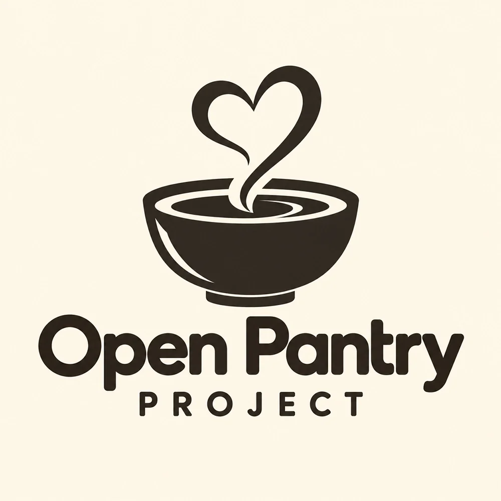
“A logo for a community food bank called Open Pantry Project, a bowl with a heart-shaped line of steam, dark brown on cream, a friendly rounded wordmark beneath”
The steam doing double duty as a heart says food and care at once, and it stays readable at donation-button size.
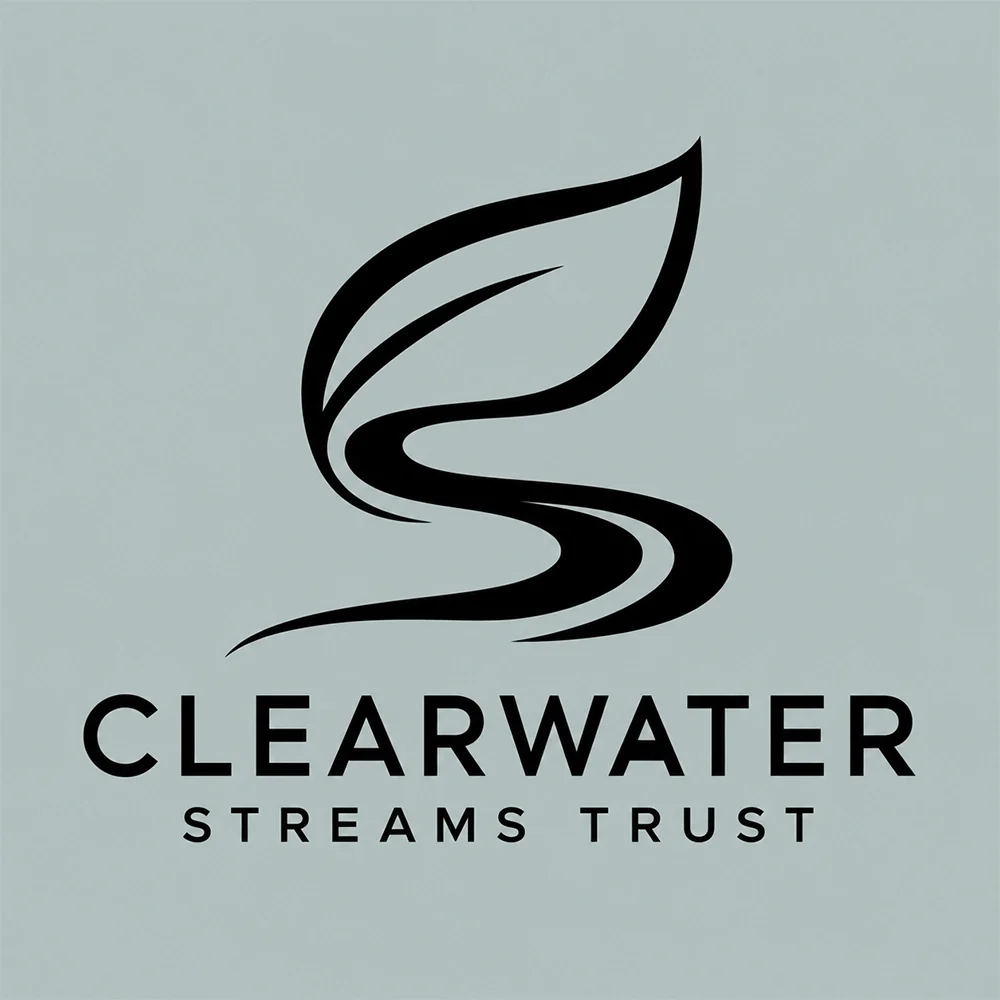
“A logo for a river conservation charity called Clearwater Streams Trust, one flowing line that is both a leaf and a stream, black on pale sage, a letterspaced wordmark beneath”
Genuinely two ideas in one line, which is what the brief asked for. The stroke tapers to a hairline at the ends, so check it before embroidering volunteer shirts.
“A logo for an adult literacy nonprofit called Second Chapter Literacy, an open book whose pages become a rising sun, black on bright orange, a bold sans wordmark beneath”
Cause and promise in one shape. The thin rays are the only fragile part at small sizes.
“A logo for an animal rescue called Paws Forward Rescue, a paw print resting in an open hand, black on light blue, a bold sans wordmark beneath”
Simple, warm and obviously about animals in someone’s care. It would print in one color on a T-shirt with no changes at all.
“A logo for a homelessness charity called Roofline Trust, a house outline drawn in one continuous line, white on warm brown, a bold wordmark beneath”
The single line is the point: it is the cheapest possible mark to print, which is the right instinct for a charity buying banners and shirts.
“A logo for a rural farming charity called Harvest Hands Foundation, a wheat stalk rising from cupped hands, gold on dark green, a serif wordmark beneath”
The most traditional mark here, and gold on green reads as established. The individual grains merge below about an inch.
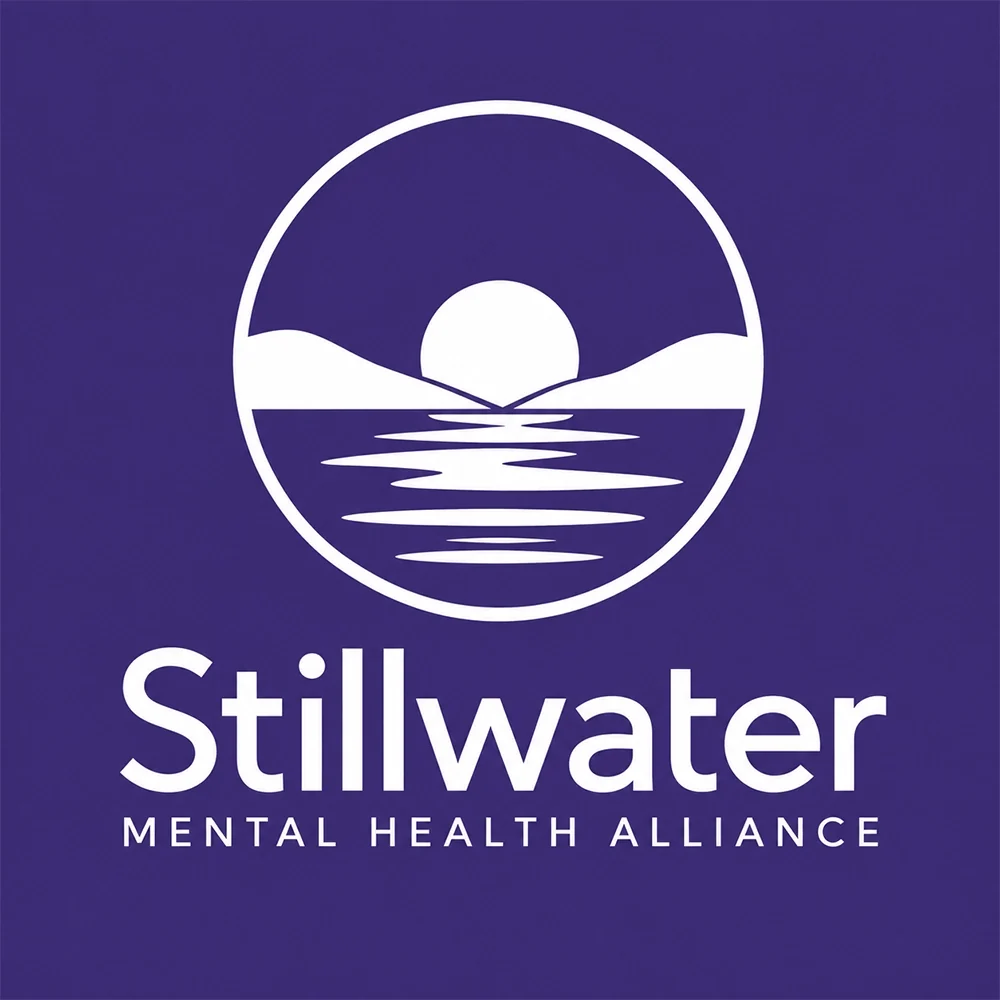
“A logo for a mental health charity called Stillwater Mental Health Alliance, a calm horizon with a sun over still water inside a circle, white on deep purple, a soft sans wordmark beneath”
Calm without being clinical, and the circle crops perfectly to an avatar. The deep purple carries more weight than the lavender in the brief.
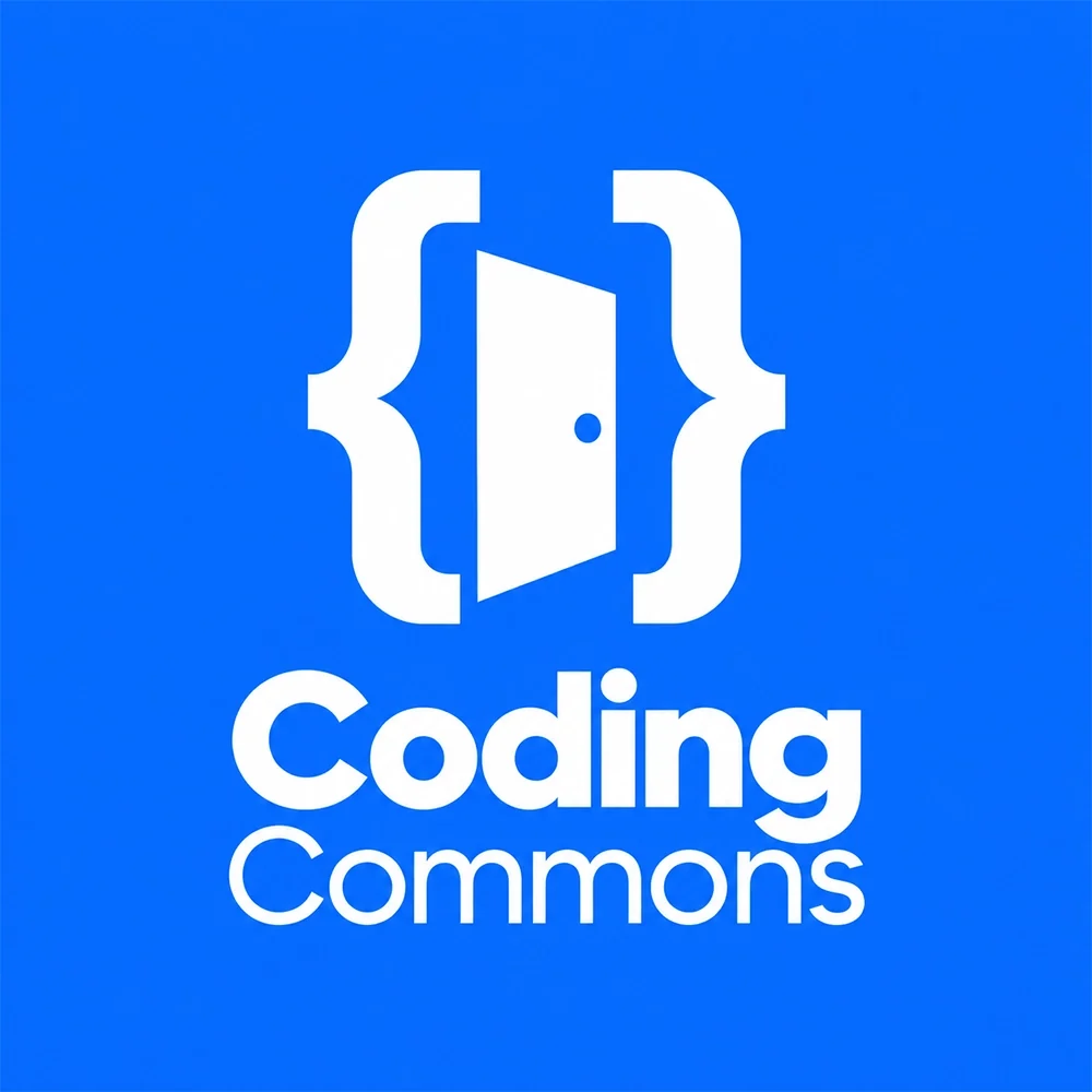
“A logo for a free coding school called Coding Commons, curly braces opening like a doorway, white on cobalt blue, a two-weight sans wordmark beneath”
The brief’s idea executed cleanly: developers read the braces instantly and everyone else sees a door.
What actually decides it. Four things.
Donors decide quickly whether an organisation is legitimate, and they make that call on surprisingly little: the website header, the donation page, a logo on a grant application. A clear symbol and a readable name signal an organisation that is run carefully. A clever double meaning that needs explaining signals the opposite. Every prompt below keeps its idea to one readable shape, and Roofline Trust, a house drawn in one continuous line, shows how plain a trustworthy mark can be.
Someone seeing your logo for the first time should be able to guess roughly what you do. A bowl with steam says food, a paw says animals, an open book says literacy. That is not literal-mindedness; it is a shortcut for donors who meet you on a crowded fundraising platform or a bank statement. The strongest executions combine the cause with the organisation’s own angle, the way the Harvest Hands Foundation prompt puts wheat in cupped hands, so the mark says both what and how.
Resembling an established charity damages trust twice: donors assume you are a copy, and the larger organisation may have trademark grounds to object. Causes attract the same symbols, so this happens more often than people expect, because hearts, hands, globes and trees recur across thousands of charities. Before you commit, search your cause and look at the logos of its best-known organisations. If yours could be mistaken for one of them at a glance, change the shape, not just the colour.
Most nonprofit branding is printed on a budget: volunteer T-shirts, event banners, donated print runs and photocopied flyers. Each extra colour adds cost to screen printing, and gradients do not print cleanly at all. One or two flat colours keep every run affordable and consistent. The Coding Commons prompt, cobalt and white, and Roofline Trust, one flat brown, are both built to print for next to nothing.
This page is part of logo ideas by industry, and its closest neighbours are church logos. If the look matters more than the constraints, see rounded logos and monoline logos. If one of these directions fits your cause, try the logo maker with your organisation’s name in the prompt.
Where it has to work. The real formats.
| Where | What it demands |
|---|---|
| Donation page | Sits beside payment fields, where trust is decided. Clean and legible beats decorative. |
| Grant applications | Often submitted as a PDF or printed in black and white, so the mark must survive without colour. |
| Event banners | Printed large and cheaply, read from across a room or a field. Bold shapes and a short name. |
| Volunteer T-shirts | Screen-printed, where every colour adds cost. One or two flat colours, no gradients. |
| Social avatar | A small circle on donation platforms and social feeds. A compact symbol reads; a long name does not. |
Every one of these is a variation, not a resize. Logo System produces each arrangement from one approved mark, with the computed minimum size and clear space, and this guide explains why those numbers matter.
Questions. Answered.
How do I make a nonprofit logo look trustworthy?
Keep it clear, consistent and plainly yours. A readable name, one simple symbol drawn from your cause and a restrained palette signal an organisation that is run carefully, which is what donors and grant makers are looking for. Avoid anything that resembles a larger charity, avoid clip-art hearts and globes that make you look generic, and use the same version of the logo everywhere, from the donation page to the volunteer shirt. Consistency is itself a trust signal.
Can a small charity afford a professional logo?
Yes. Generating logo directions with AI costs a small fraction of a design agency brief, and it lets a board or committee react to real options instead of describing an idea in a meeting. On Logofai, new accounts get 6 free credits with no card required and a logo image costs 3 credits, so a small charity can try two directions before spending anything. Paid plans start at $9.99 a month for 150 credits.
What files do grant applications and printers ask for?
Grant portals usually want a PNG or JPG for online forms and a PDF for attachments, often in black and white. Printers want a vector file, SVG, EPS or PDF, so the logo scales to a banner without blurring, plus a one-colour version for screen-printed T-shirts and a transparent-background version for placing over photos. Keep them all in one shared folder so volunteers do not screenshot the logo from your website. On Logofai, SVG export is available on any subscription.
More industries: law firms, contractors, consulting firms, accountants, bars, cleaning companies, real estate agents, musicians and bands, churches and ministries, beauty and cosmetics, security companies, restaurants, medical and dental, jewelers, logistics and trucking, spas and wellness.
Your name, your prompt.
Or have your current logo scored on seven dimensions.
Running a small business? The small business logo maker shows logos for every kind of local company.