
The Arabic logo maker.
Arabic letters join, the script reads right to left, and the choice between Naskh and Kufi is a brand decision. Here is what that means for a logo, with six real examples.
Write the brand name exactly as it should appear, in its own script. New accounts get 6 free credits, no card required, and each logo image uses 3.
What makes a Arabic logo different
An Arabic wordmark cannot be treated like a Latin one. The letters connect along a shared baseline, most of them change shape depending on where they sit in the word, and there are no capital letters to lean on for emphasis. Spacing a name out letter by letter, a common trick in Latin logos, breaks the word apart.
That makes the style of script the first real decision. Naskh is the calm, readable hand used in books and signage. Kufi is angular and geometric, and sits well next to modern Latin type. Thuluth and Diwani are expressive and ornamental, and suit calligraphic marks more than small labels.
6 Arabic logos. What to refine.
Each logo below is shown exactly as generated, next to the direction behind it and a note on what a designer would change next.
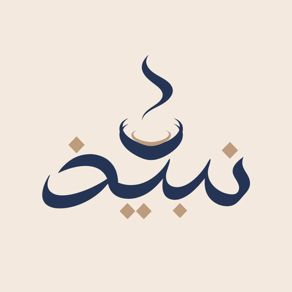
“An Arabic calligraphy wordmark for a Saudi cafe called Nabidh, the letters cradling a steaming coffee cup, deep navy and warm tan on cream.”
The cup sits inside the letters rather than beside them, which is the whole idea. It is part of a full case study with cups, signage and packaging. See the Nabidh case study.
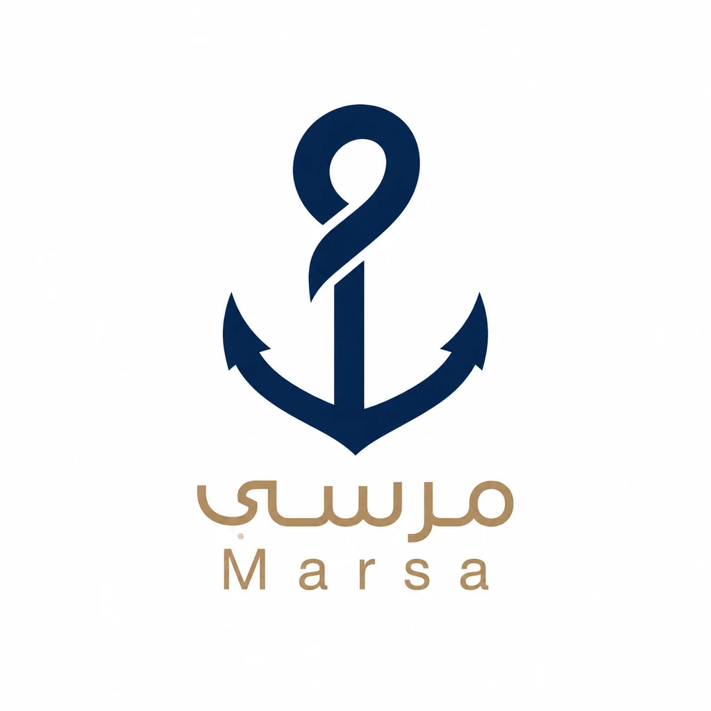
“A geometric Arabic monogram for a coastal boutique hotel called مرسى (Marsa), the letter meem reduced to a single anchor-like stroke, deep navy and sand.”
The anchor reads instantly and the wordmark below stays calm. The anchor is more literal than the brief asked for, so push it back toward the meem if the hotel wants something quieter.
“An Arabic logo for a lighting studio called سراج (Siraj), a minimal lantern symbol above a clean Naskh wordmark, warm brass on charcoal.”
Brass on charcoal looks expensive, and the Naskh wordmark is well weighted. The lantern is detailed, so draw a simpler version for small sizes.
“Not from the brief: a tower-and-arch symbol above a thin Arabic wordmark, gold on charcoal, for a property brand.”
The arch ties the tower to Arabic architecture without cliché. The thin wordmark and the spaced Latin line underneath will fade at small sizes.
“Not from the brief: a globe with a location pin and speed lines above a bold Arabic wordmark, green and gold, for a delivery brand.”
The bold wordmark reads well small. The symbol stacks a globe, a pin, route dots and speed lines; keep one idea and drop the rest.
“A clean modern Arabic wordmark for an artisan bakery called قمح (Qamh), simple even strokes that stay legible small, warm ochre on off-white.”
Even strokes and open counters, exactly as asked. The spaced Latin name underneath is much lighter than the Arabic, so match the weights.
What to check in a Arabic logo
- Read it right to left. The eye starts on the right. A symbol placed on the left of a bilingual lockup is the last thing an Arabic reader sees, which may be exactly what you want or the opposite.
- Keep the letters joined. Never letter-space Arabic. If a name needs more width, stretch the connecting strokes (kashida) instead, and use it sparingly.
- Leave room above and below. Dots, hamza and descending tails reach well past the line. A tight crop or a thin frame will clip them.
- Plan the bilingual lockup. Most Arabic brands also need a Latin name. Decide which script leads, and match their weights so neither looks borrowed.
- Test at small size. The dots are what separate many letters. If they merge at favicon size, the word changes.
Naming a Arabic brand
Arabic brand names often come from a single evocative noun: a place, an object or a craft. Short names of two or three letters in their root form, like قمح (wheat), give a designer room to build a symbol from the letterforms themselves.
Making a Arabic logo with Logofai
Describe the business in one sentence and write the name in Arabic exactly as it should be drawn, in quotes if it helps. Name the style you want, such as a calligraphic wordmark, a monogram or a badge, and two or three colors. Each run gives one to four options at 3 credits an image, and you can refine the one you like by describing the change.
Check every letter and mark with a native reader before you use a logo, whichever tool made it. Logofai itself is available in Arabic: see the Logofai homepage in العربية. For the general guide to prompts and results, see the AI logo maker.
Good questions.
Can an AI logo maker write Arabic correctly?
Often, but not always. Check every letter, the dots and the joins with a native reader before you print anything.
Should my logo be in Arabic, English or both?
If your customers read Arabic first, lead with Arabic and add a Latin name as a secondary line. Design both together so their weights and heights match.
Your name, in your script.
Describe the business and write the name in Arabic. See your first options in a minute.
6 free credits for new accounts, no card required.