


The Russian logo maker.
Cyrillic looks close enough to Latin to fool a designer, and then it breaks. Five real examples, and the letters that cause the trouble.
Write the brand name exactly as it should appear, in its own script. New accounts get 6 free credits, no card required, and each logo image uses 3.
What makes a Russian logo different
Several Cyrillic letters look like Latin ones but mean something else: В is V, Н is N, Р is R. Others have no Latin match at all. Ж, Ш, Щ and Ф are much wider than any Latin letter, and Д, Ц and Щ hang below the baseline, so a wordmark spaced with Latin habits reads uneven.
Lowercase Cyrillic adds another trap. Letters like в, к and т look like small capitals, so a lowercase Russian wordmark can read as oddly mixed case to a Latin eye while being perfectly correct. Always judge Cyrillic logos with a native reader, not by how they look to an English speaker.
5 Russian logos. What to refine.
Each logo below is shown exactly as generated, next to the direction behind it and a note on what a designer would change next.
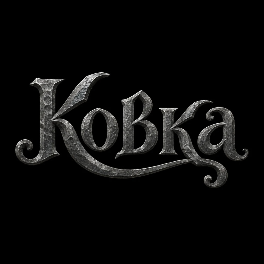
“A calligraphic Cyrillic wordmark for a metalwork studio called Ковка (Kovka), heavy hand-lettered strokes with a forged feel, iron grey on black.”
A strong forged feel. The в is drawn as a tall capital, which makes the word look mixed case; draw it at lowercase height. The metal texture needs a flat version.
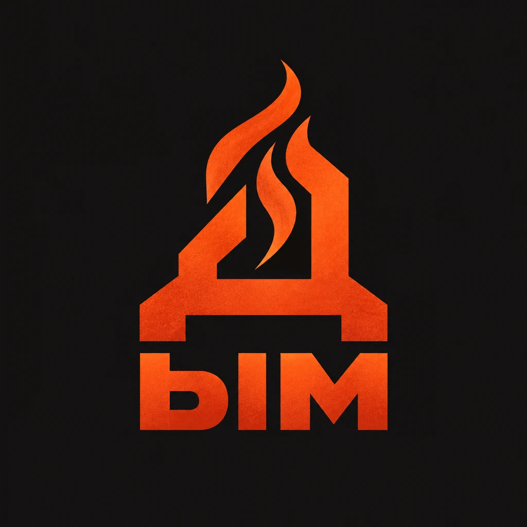
“A geometric Cyrillic monogram for a barbecue restaurant called Дым (Dym), the letter Д reduced to a clean angular mark with its descender intact, ember orange on charcoal.”
The Д with a flame inside keeps its descenders, as asked, and doubles as the first letter of the name. A strong, simple mark.
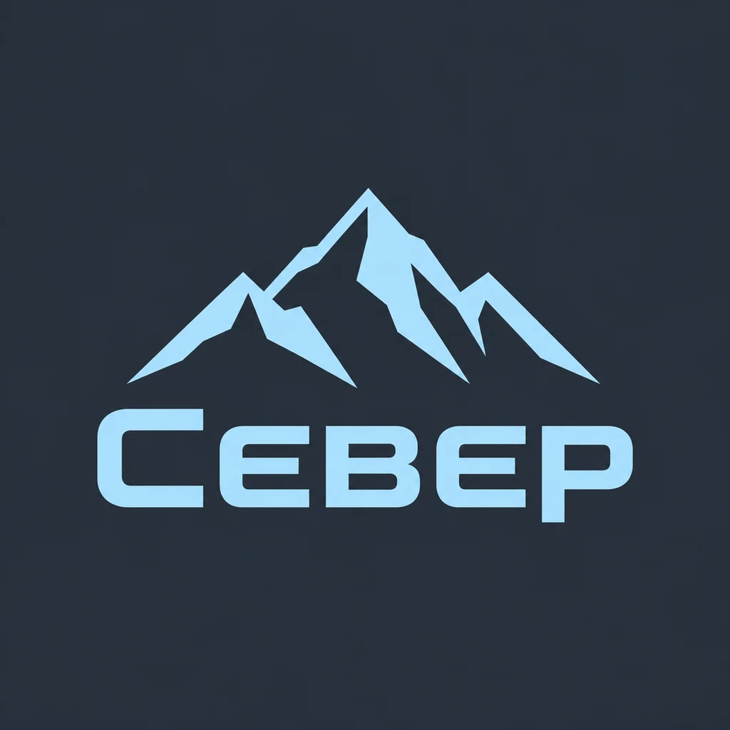
“A Cyrillic logo for an outdoor gear brand called Север (Sever), a minimal mountain symbol above a clean wordmark, glacier blue on slate.”
Clean and legible, with a mountain that says outdoors at once. The pale blue needs a darker version for use on white.
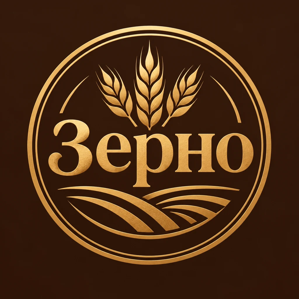
“A Cyrillic badge logo for a bakery called Зерно (Zerno), the wordmark set inside a round grain stamp, wheat gold on deep brown.”
Well-drawn Cyrillic inside a warm seal. The metallic shading is illustration; flatten it for bread bags.
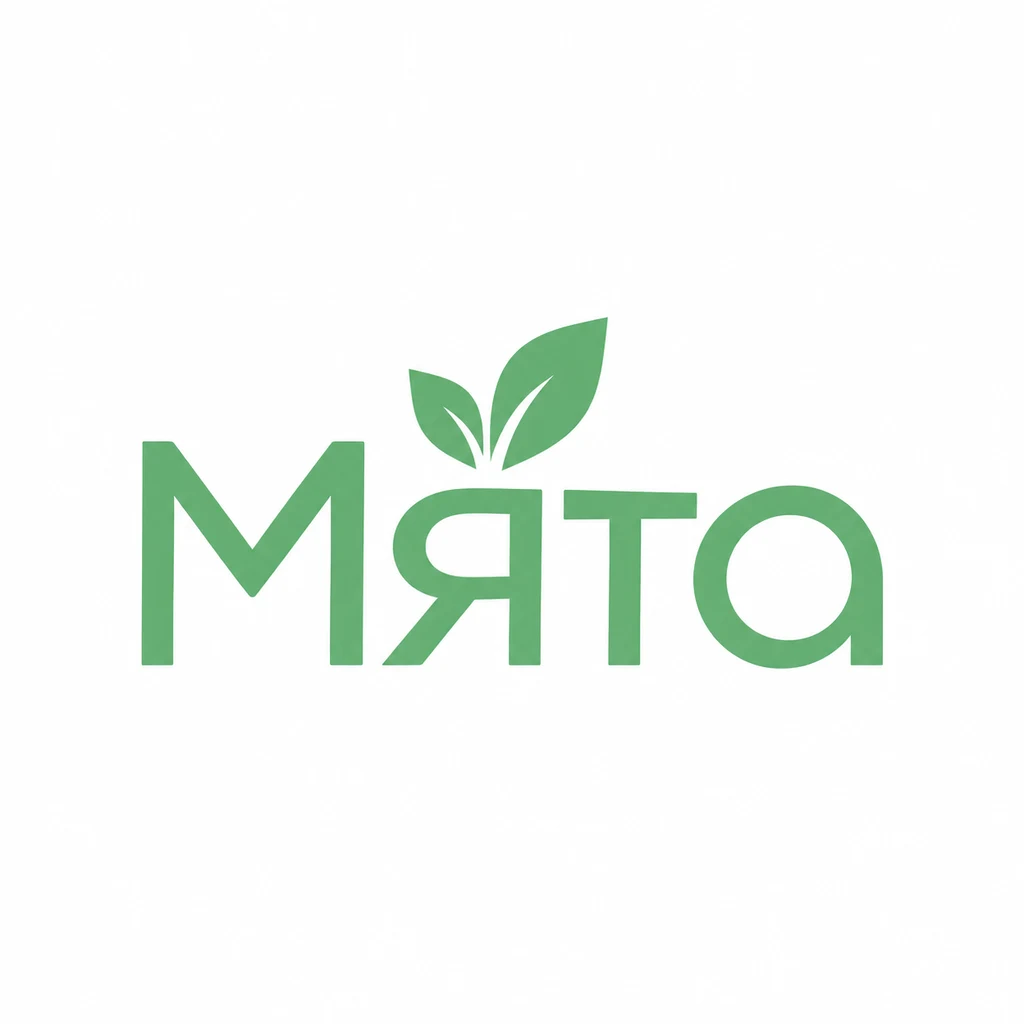
“A clean modern Cyrillic wordmark for a cosmetics brand called Мята (Myata), even letter widths tuned for small sizes, mint green on white.”
Clean, fresh and legible, with a mint leaf on the Я. It works small as it is.
What to check in a Russian logo
- Watch the wide letters. Ж, Ш, Щ and Ф take more space. Adjust the spacing around them so the word looks even.
- Keep the descenders. Д, Ц and Щ need room below the line. A tight crop or a baseline rule will cut them.
- Check lookalike letters. Make sure every letter is Cyrillic, not a Latin letter that looks the same. It matters for search and for readers.
- Decide on the Latin version. Many Russian brands also need a transliterated name. Pick one spelling and keep it everywhere.
Naming a Russian brand
Russian brand names are often short, concrete nouns: Север (north), Зерно (grain), Мята (mint). Short names suit bold Cyrillic type and leave room for a symbol.
Making a Russian logo with Logofai
Describe the business in one sentence and write the name in Russian exactly as it should be drawn, in quotes if it helps. Name the style you want, such as a calligraphic wordmark, a monogram or a badge, and two or three colors. Each run gives one to four options at 3 credits an image, and you can refine the one you like by describing the change.
Check every letter and mark with a native reader before you use a logo, whichever tool made it. Logofai itself is available in Russian: see the Logofai homepage in Русский. For the general guide to prompts and results, see the AI logo maker.
Good questions.
Why do some Russian logos look like they use capital letters in the middle?
Several lowercase Cyrillic letters, like в, к and т, look like small capitals. Drawn at the right height they are correct; drawn too tall, they read as mixed case.
Should a Russian logo include a Latin name?
If you sell outside Cyrillic-reading markets, yes. Choose one transliteration and use it consistently in the logo, domain and social handles.
Your name, in your script.
Describe the business and write the name in Russian. See your first options in a minute.
6 free credits for new accounts, no card required.