


The Japanese logo maker.
Japanese has three writing systems, and choosing between them is a positioning decision before it is a typographic one. Five real examples across all three.
Write the brand name exactly as it should appear, in its own script. New accounts get 6 free credits, no card required, and each logo image uses 3.
What makes a Japanese logo different
Kanji are the characters borrowed from Chinese, dense and formal, the natural choice for sake, tea and anything with heritage. Hiragana is the rounded native script, soft and domestic, and suits cafes and family brands. Katakana is angular and mostly used for foreign words, so it reads modern and technical.
The same name can be written in any of the three and send a different message each time. That is a freedom Latin brands do not have, and it is the first decision to make for a Japanese logo. The second is density: a kanji with many strokes turns to a blot at favicon size.
5 Japanese logos. What to refine.
Each logo below is shown exactly as generated, next to the direction behind it and a note on what a designer would change next.
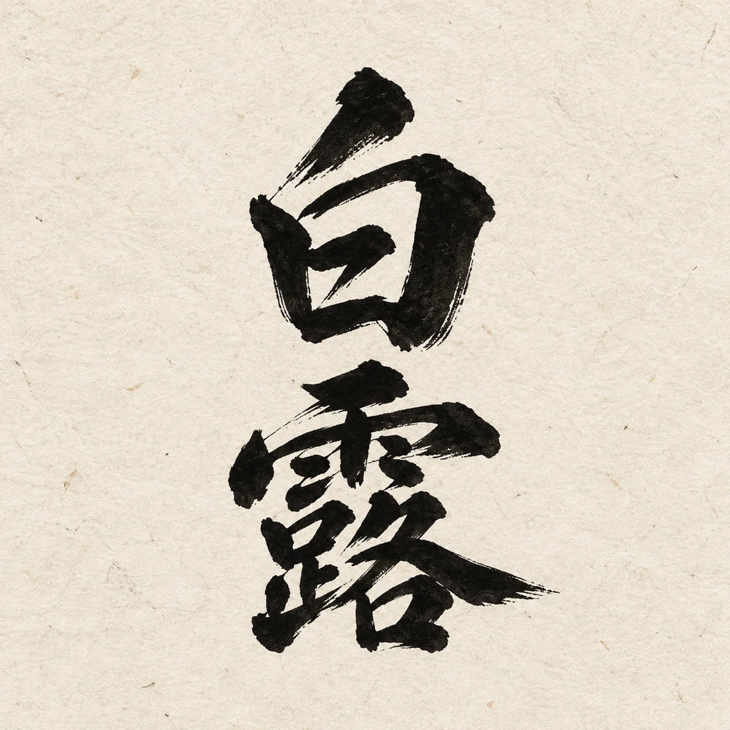
“A calligraphic Japanese brush wordmark for a sake brewery called 白露 (Hakuro), confident sumi ink strokes, black on unbleached paper.”
Confident brushwork set vertically, exactly right for sake. The dry-brush edges will not survive screen printing on bottles; keep a smoothed version.
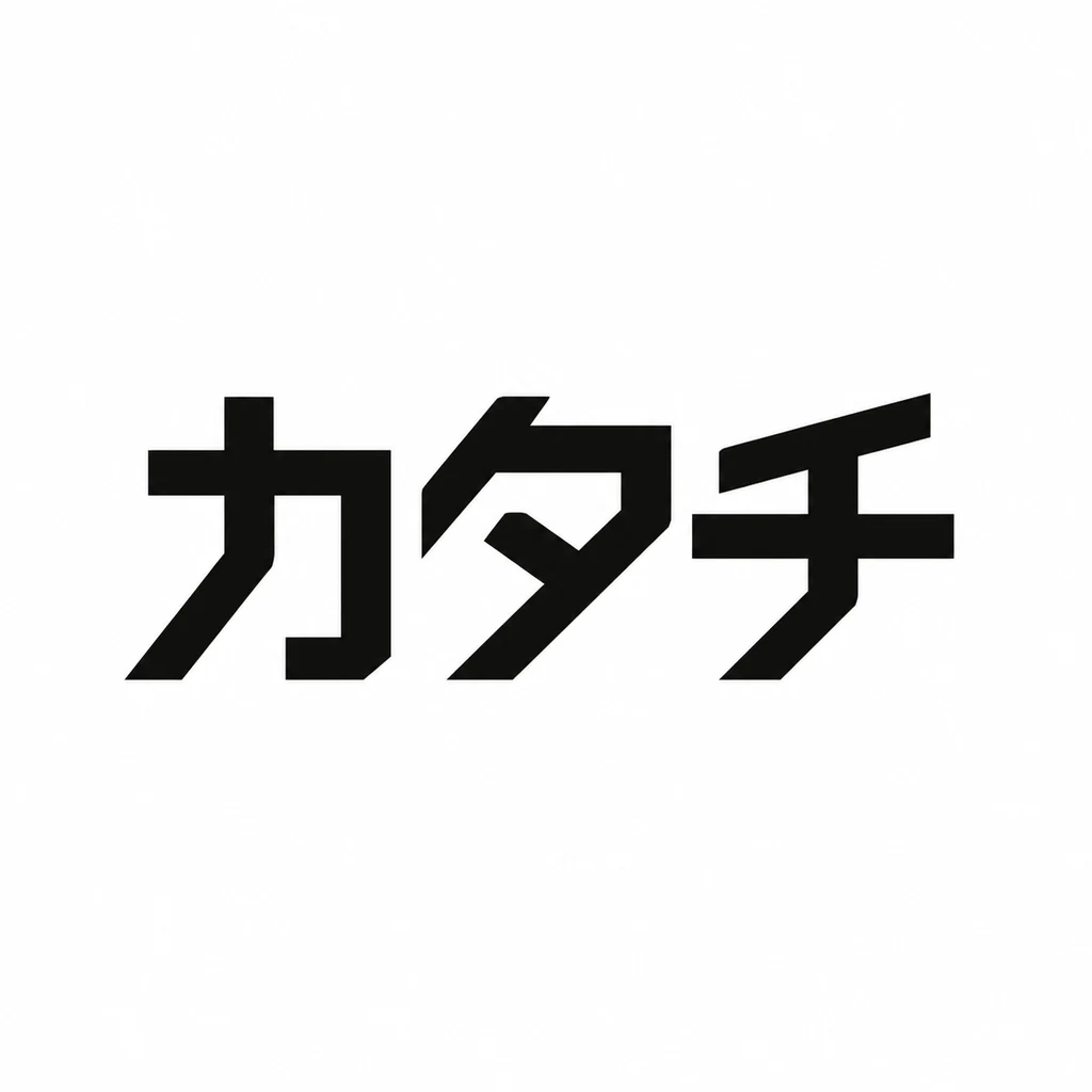
“A geometric Japanese katakana monogram for a design studio called カタチ (Katachi), the characters built from a single stroke weight, black on white.”
Bold, even katakana that reads modern and technical. It is a wordmark rather than a monogram; one character on its own would make an app icon.
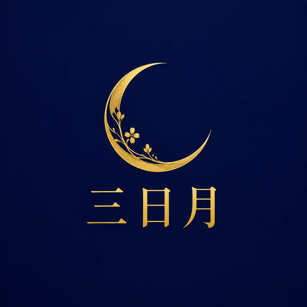
“A Japanese logo for a patisserie called 三日月 (Mikazuki), a fine crescent moon symbol above a clean kanji wordmark, gold on deep indigo.”
Gold on indigo feels premium, and the small flowers on the crescent add warmth. The thin kanji will fade on a small box; add weight.
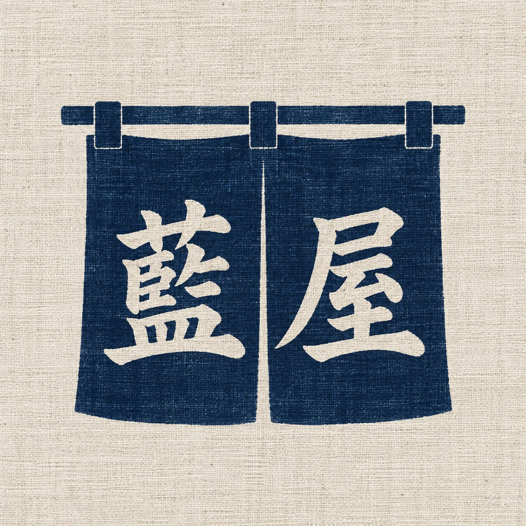
“A Japanese noren-style badge logo for an indigo dyeing atelier called 藍屋 (Aiya), the kanji set in a fabric banner shape, indigo blue on natural linen.”
The noren banner is a native badge form and makes the craft clear. The fabric texture and the rod are illustration; draw a flat version for stamps.
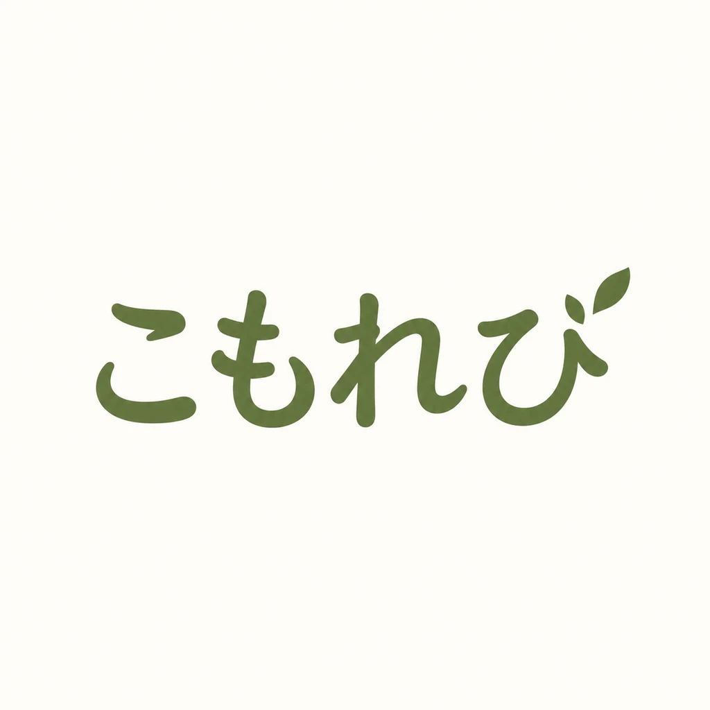
“A clean modern Japanese hiragana wordmark for a cafe called こもれび (Komorebi), soft rounded strokes that stay legible small, moss green on warm white.”
Soft rounded hiragana with a small leaf, warm and readable. It holds up at small sizes as asked.
What to check in a Japanese logo
- Choose the script deliberately. Kanji for heritage, hiragana for warmth, katakana for modern and technical. Mixing them in one name is common, but it should be a choice.
- Test stroke density. Complex kanji fill in when small. Check the logo at 32 pixels and simplify or pick a lighter weight.
- Decide horizontal or vertical. Japanese can be set vertically, which suits signage and noren banners. Many brands need both versions.
- Pair with Latin type carefully. If you add a romanized name, match the visual weight of the Japanese characters, which usually look heavier at the same size.
Naming a Japanese brand
Japanese brand names often borrow from nature and the seasons: 白露 (white dew), 三日月 (crescent moon), こもれび (sunlight through leaves). The poetry of the name is part of the brand, so the logo should give the characters room.
Making a Japanese logo with Logofai
Describe the business in one sentence and write the name in Japanese exactly as it should be drawn, in quotes if it helps. Name the style you want, such as a calligraphic wordmark, a monogram or a badge, and two or three colors. Each run gives one to four options at 3 credits an image, and you can refine the one you like by describing the change.
Check every letter and mark with a native reader before you use a logo, whichever tool made it. Logofai itself is available in Japanese: see the Logofai homepage in 日本語. For the general guide to prompts and results, see the AI logo maker.
Good questions.
Should a Japanese logo use kanji, hiragana or katakana?
Kanji suggests heritage and formality, hiragana warmth and softness, katakana modernity. Choose the one that matches how you want customers to feel, and check the reading with a native speaker.
Can Japanese logos be vertical?
Yes. Vertical setting is natural in Japanese and suits signage and banners. Most brands keep a horizontal version for websites and packaging too.
Your name, in your script.
Describe the business and write the name in Japanese. See your first options in a minute.
6 free credits for new accounts, no card required.