
These logo design ideas for graphic designers are grouped by technique, not by industry. Each technique comes with a note on when it works and what to refine, then a prompt you can paste into an AI logo tool, the result it produced, and what I would change next. Every business name is invented, and every image is shown exactly as generated.
The eight techniques:
- Negative space: Negative space works when the hidden shape is simple enough to find in a second and relevant enough to reward finding it.
- Monograms: Monograms suit names that are long, personal or professional: studios, practices and fashion labels.
- Geometric construction: Geometric marks read as precise and technical, which suits finance, energy, data and making.
- Wordmarks and custom type: A wordmark is the right answer when the name is short, distinctive and the brand will be read more than recognized.
- Emblems and badges: Emblems suit brands with heritage or place: breweries, outdoor companies and barbers.
- Mascots and characters: A mascot earns its place when the brand talks to families, kids or fans and needs a face for packaging and social media.
- Responsive logo systems: Every brand that appears on phones needs a responsive system: a full lockup for large spaces and a reduced mark for small ones.
- Motion-ready and flexible marks: Flexible marks suit brands that live on screens or change often: festivals, agencies, galleries and media.
Use the prompts to explore, then take the strongest direction into your own tools. None of the results below is finished artwork.
How to use these prompts
Each prompt follows the same pattern: the business, the idea, and the color. Swap in your client's name and industry and keep the technique. Generate a few runs, keep the direction that surprises you, then refine with your own sketch as a reference. The AI logo design tool page explains how that fits a client project.
The results below were generated from these prompts on September 17, 2026, one prompt each. Several missed part of the brief, and the notes say where, because spotting that is the designer's job.
Negative space
Negative space works when the hidden shape is simple enough to find in a second and relevant enough to reward finding it. It suits brands that want to feel clever without being loud.
What to refine: Check that the hidden shape survives at small sizes, and widen the gaps before anything else.
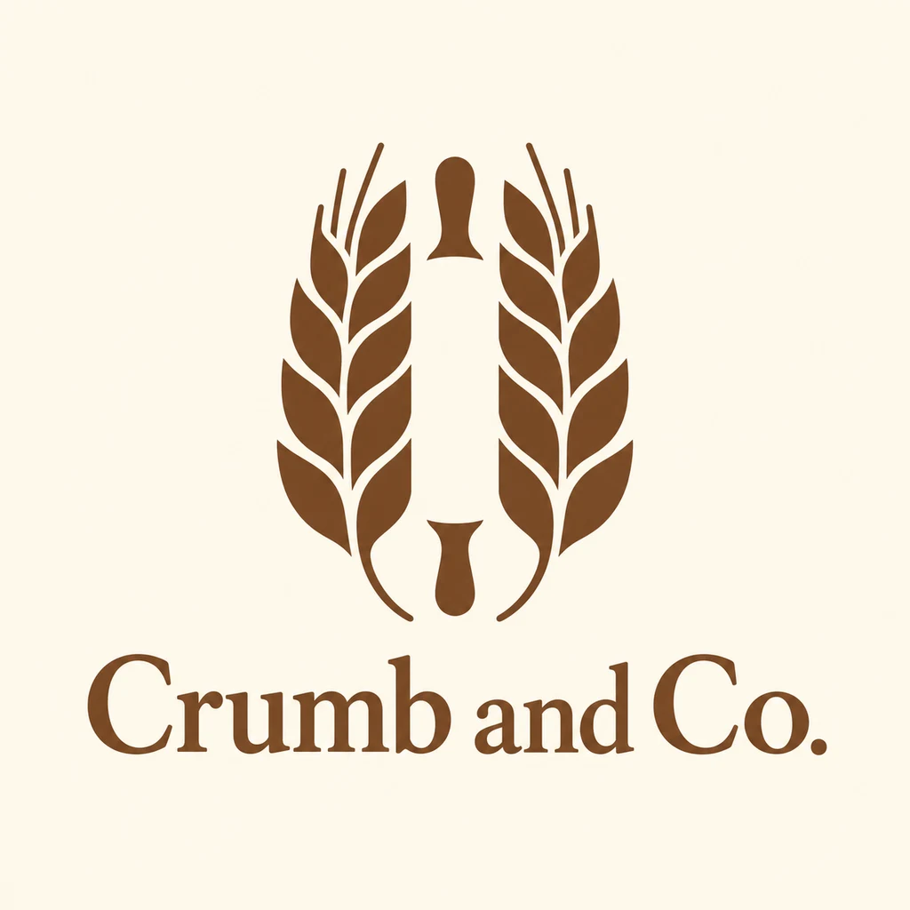
“A logo for a bakery called Crumb and Co. A rolling pin hidden in the negative space between two wheat stalks, warm brown on cream.”
What I’d refine: The rolling pin came back as a solid shape between the stalks, not hidden in negative space. Cut it out of the wheat instead to earn the idea.
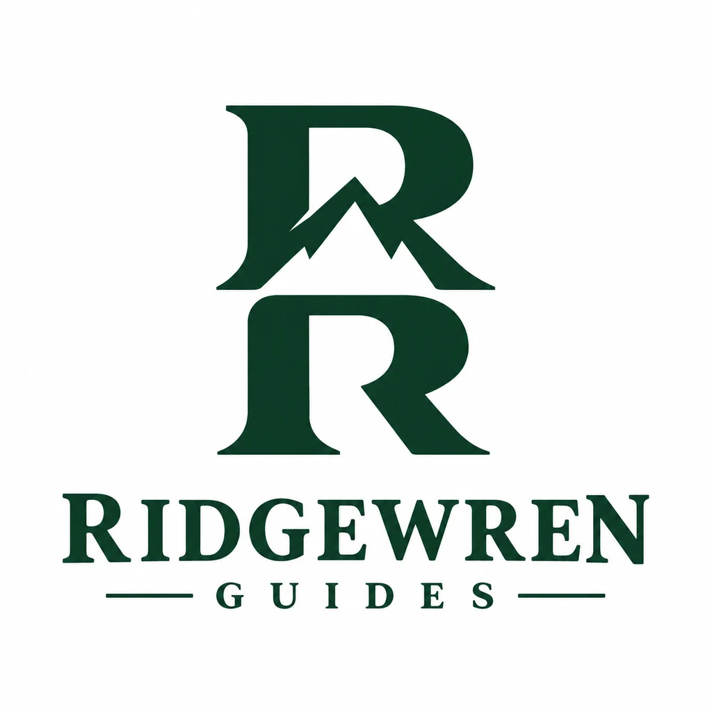
“A logo for a mountain guide service called Ridgewren Guides. A mountain peak formed by the gap between two letters R, deep green.”
What I’d refine: The peak sits cleanly in the gap between the two letters. Drop the rules around GUIDES and check the peak still reads at avatar size.
“A logo for a bookshop called Open Spine. An open book whose inner gutter forms a standing figure, navy on off-white.”
What I’d refine: The figure in the gutter works on first look. Simplify the page curls on top, which will fill in at favicon size.
“A logo for a courier called Arrowdash. A forward arrow carved into the space inside a letter A, black and signal orange.”
What I’d refine: The arrow arrived as speed lines beside the A rather than carved inside it. Rebuild the A with the arrow as its counter.
Monograms
Monograms suit names that are long, personal or professional: studios, practices and fashion labels. They need a strong structure, because two letters on their own carry little meaning.
What to refine: Rebuild the letters on your own grid and even out stroke weights where the letters overlap.
“A logo for an architecture studio called Harlow Kent. An interlocking HK monogram built on a strict square grid, black only.”
What I’d refine: Strict and quiet, as asked. The crossbar kinks where it meets the K; straighten it on a real grid.
“A logo for a jewelry brand called Selene Vey. A delicate SV monogram with a fine crescent joining the letters, gold on ivory.”
What I’d refine: Elegant, but the hairline crescent and the added star will vanish on a small tag or in foil. Thicken the crescent and drop the star.
“A logo for a law practice called Morgan and Adeyemi. A two-letter MA monogram in high-contrast serif inside a thin circle, burgundy.”
What I’d refine: A confident ligature that looks at home on letterhead. The thin circle is the first thing to disappear small, so test the mark without it.
“A logo for a coffee roaster called Ode Roasters. A rounded OR monogram where the O doubles as a coffee bean, espresso brown.”
What I’d refine: The bean inside the O reads immediately. The R is heavier than the O, so balance the weights before it goes on a bag.
Geometric construction
Geometric marks read as precise and technical, which suits finance, energy, data and making. The construction is part of the story, so it should be visible.
What to refine: Snap every curve and angle to real geometry; generated marks are usually close but not exact.
“A logo for a fintech startup called Qivra. A symbol built from three overlapping circles on a golden-ratio grid, cobalt.”
What I’d refine: Three clean rings, but the circles look equal in size rather than golden-ratio. Rebuild the construction and open up the tail of the Q.
“A logo for a solar installer called Helio Grid. A sun made of a single hexagon split into six triangles, amber and charcoal.”
What I’d refine: The hexagon sun says solar in one glance. Widen the gaps between the triangles so they stay open on a van or a small screen.
“A logo for a data consultancy called Slantline Data. Two offset parallelograms suggesting forward motion, teal.”
What I’d refine: Simple and scalable. Slanted bars are common in data branding, so push the angle or proportion until the mark feels ownable.
“A logo for a furniture maker called Joinery Lab. A dovetail joint drawn as a clean geometric mark, oak brown.”
What I’d refine: It came back as a shaded 3D joint rather than a flat mark. Flatten it to one or two tones before it has to be branded into wood.
Wordmarks and custom type
A wordmark is the right answer when the name is short, distinctive and the brand will be read more than recognized. One custom detail is usually enough.
What to refine: Check every letter, set the kerning by hand and redraw the custom detail as real type.
“A logo for a running club called Pace Society. A condensed italic wordmark with a stretched P suggesting speed, black.”
What I’d refine: The stretched P carries the speed. The condensed letters crowd in places, so kern the whole word by hand.
“A logo for a skincare brand called Dunelle. A wide lowercase wordmark with softened terminals, sand on white.”
What I’d refine: Soft and wide, exactly as asked. Sand on white is too pale for packaging and accessibility, so choose a darker working color.
“A logo for a record shop called Groove Hall. A bold wordmark where the two O letters become vinyl records, black and red.”
What I’d refine: The vinyl letters are fun and still legible. Simplify the grooves so they survive a small sticker or a stamp.
“A logo for a tech conference called Stackrise. A monospace wordmark with one letter shifted up a line, electric green on black.”
What I’d refine: One raised letter, one clear idea. Check the green on light backgrounds too, since conference badges are rarely black.
Emblems and badges
Emblems suit brands with heritage or place: breweries, outdoor companies and barbers. They carry a lot of detail, so they need a simpler companion mark.
What to refine: Cut the detail by a third and design a small version without the banner text.
“A logo for a craft brewery called Iron Kettle. A round emblem with a kettle, a banner and two hop cones, copper and black.”
What I’d refine: Rich, but rendered with metallic gradients and fine detail. Redraw it in two or three flat colors for cans, taps and embroidery.
“A logo for a national park tour company called Switchback Trails. A shield badge with pines and a winding path, forest green and cream.”
What I’d refine: A classic badge that reads well. Cut the number of trees so the winding path stays the hero at patch size.
“A logo for a barbershop called Keenblade Barbers. A vintage badge with crossed razors and a pole, black and brick red.”
What I’d refine: Plenty of character, but also filigree, a date line and a shaded pole. Halve the ornament and design a razors-only mark for small uses.
Mascots and characters
A mascot earns its place when the brand talks to families, kids or fans and needs a face for packaging and social media. It also needs to work in more than one pose.
What to refine: Simplify the character to a few shapes and check it still reads as a small icon.
“A logo for a pet food brand called Grubwag Kitchen. A friendly dog chef character in a simple flat style, warm orange.”
What I’d refine: Warm and friendly, though more detailed than flat, with outlines, shading and paw prints. Draw a simplified head for social avatars and the pack corner.

“A logo for a kids’ coding school called Bitsprout. A small round robot character with a big smile and a sprout on its head, bright blue and yellow.”
What I’d refine: Cheerful, and the sprout ties the character to the name. Build a head-only version for the app icon and certificates.
“A logo for a hot sauce brand called Ember Owl. An owl with flame-shaped feathers, red and black, bold and simple.”
What I’d refine: Bold, but the flame feathers are dense. Reduce them to a few large flames so the owl prints cleanly on a small bottle label.
Responsive logo systems
Every brand that appears on phones needs a responsive system: a full lockup for large spaces and a reduced mark for small ones. Designing the set together keeps the pieces related.
What to refine: Test each version at its real size and make the small mark bolder than feels natural.
“A logo for a hotel called Hotel Lindwood. A full lockup with a linden leaf and serif wordmark, plus a leaf-only version for small sizes, sage.”
What I’d refine: The lockup and the leaf clearly belong together. The leaf keeps its fine vein texture, which is wrong for the small version; flatten it.
“A logo for a streaming app called Gleamloop. A wordmark, a stacked version and an app icon built from the letter G as a film reel, violet.”
What I’d refine: The G-shaped reel is a good idea, but it came back glossy and 3D. Redraw it flat and add the horizontal wordmark, which is missing from the set.
“A logo for a city bike share called Pedalport. A horizontal lockup and a wheel-only icon that still reads at 16 pixels, cobalt.”
What I’d refine: A matched lockup and icon. Eight spokes will close up at 16 pixels, so drop to four or five for the smallest size.
Motion-ready and flexible marks
Flexible marks suit brands that live on screens or change often: festivals, agencies, galleries and media. The rules of the system matter more than any single frame.
What to refine: Define the rules of motion or variation first, then rebuild the mark so it follows them.
“A logo for a music festival called Tidesound. A simple wave mark designed so its lines can animate, magenta on black.”
What I’d refine: Three separate waves are easy to animate one by one. It came back on white instead of black, so test the magenta on dark stage screens.
“A logo for a design agency called Turnfold Studio. A square mark that can rotate into four positions, black and white.”
What I’d refine: The folded square suggests rotation well. Check that each of the four positions still reads before building the system.
“A logo for a podcast network called Loopline. A continuous line forming an infinity loop that could draw itself on screen, teal.”
What I’d refine: The loop has two breaks, so it is not the single continuous line asked for. Close it if the mark needs to draw itself.
“A logo for a climate nonprofit called Leafward Fund. A leaf built from stacked horizontal lines that can fill like a progress bar, green.”
What I’d refine: The stacked lines make the progress-bar idea obvious. Widen the gaps between them so the leaf survives small screens.
“A logo for a gallery called Frame Theory. A variable frame mark that changes proportion for each exhibition, black.”
What I’d refine: Two offset frames hint at variation. Write the rules for how the proportion changes, then draw three versions to prove them.
From idea to client-ready
A generated concept is where the work starts. Rebuild the winner as clean vectors, test it at favicon size, and check it against existing trademarks before the client sees it. For the tools that help at each step, see our guide to the best AI tools for graphic designers, and for more prompt patterns, the AI logo prompt examples.